
House Beautiful x Colordrunk May/June 2025 Issue
As featured in House Beautiful’s May/June 2025 Color Issue, the home of Atlanta-based interior designer Jenna Gross is proof that living can be functional, beautiful, and brilliantly bold. Her full-service design firm, Colordrunk Designs, was founded in 2013 and outfits some of the most colorful residential and commerical spaces in the country. This jaw-dropping redesign of Jenna’s five-bedroom home is filled with the works of talented Gregg Irby Gallery artists. We are so excited to show off Jenna’s stunning home from the House Beautiful article as well as the fabulous original paintings of our artists!
WRITTEN BY: JESSICA CHERNER | PUBLISHED: MAY/JUNE 2025
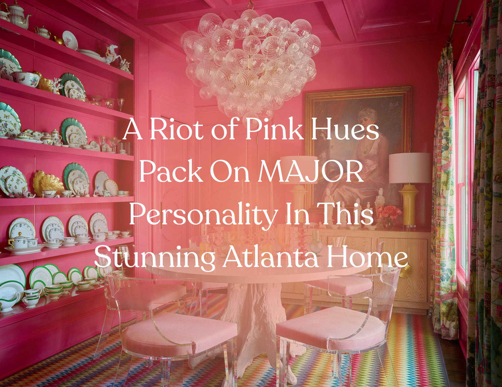
Plenty of people take the advice "respect your elders" seriously, but Colordrunk Designs founder Jenna Gross lives by it. When she rebuilt, renovated, and designed her family's five-bedroom Atlanta home, her late grandparents' colorful residence was the driving force that inspired her. "I even had our pink front door custom-made to look just like my grandparents'," she admits. The rest of the foyer follows suit, with a boldly patterned area rug, colorful wallpaper, and cheerful paint.
Color is the through line of the house's aesthetic, though using so many hues was not without its difficulties. "With so many spaces open to each other, it can be tough to make all the rooms flow—especially when you love as much color as I do," Gross says. "I spent a lot of time with the whole scheme laid out on the floor, making sure each room featured a color that flowed to the next."
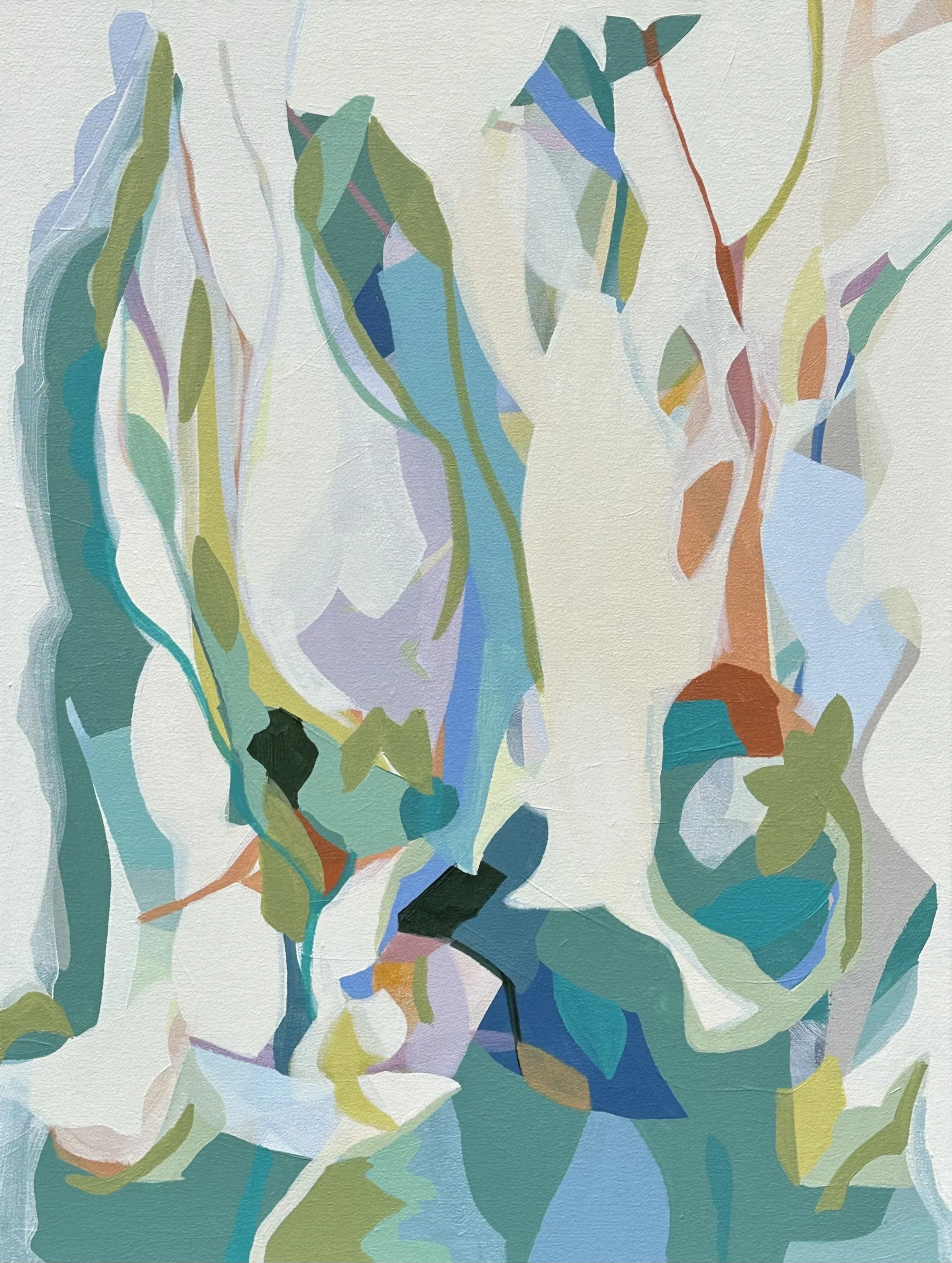
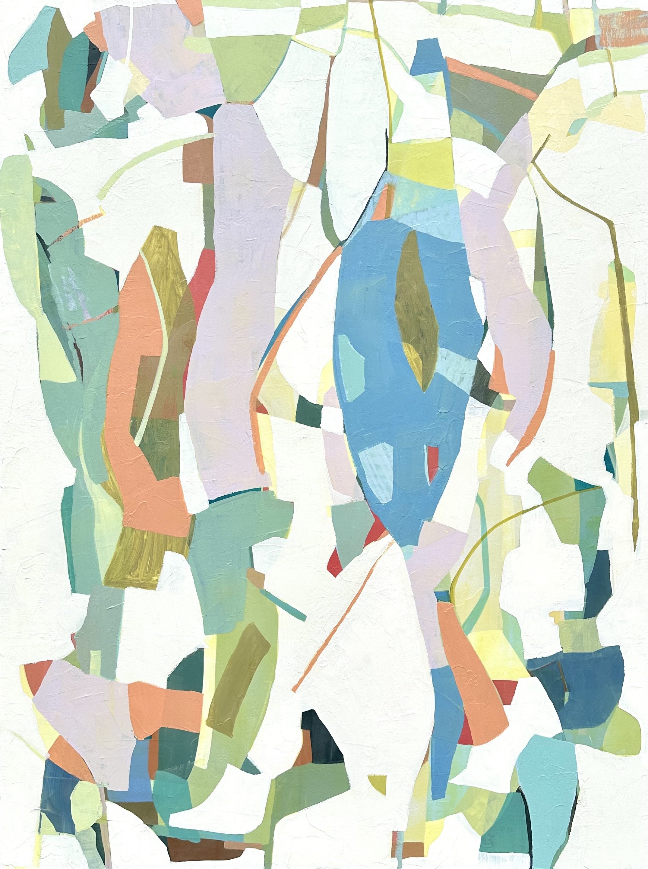
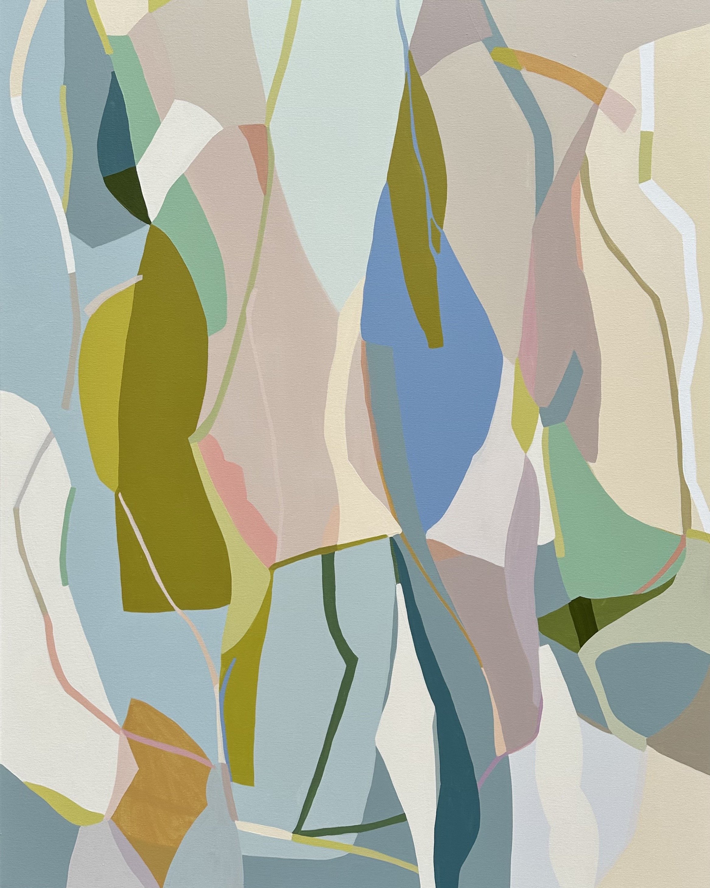
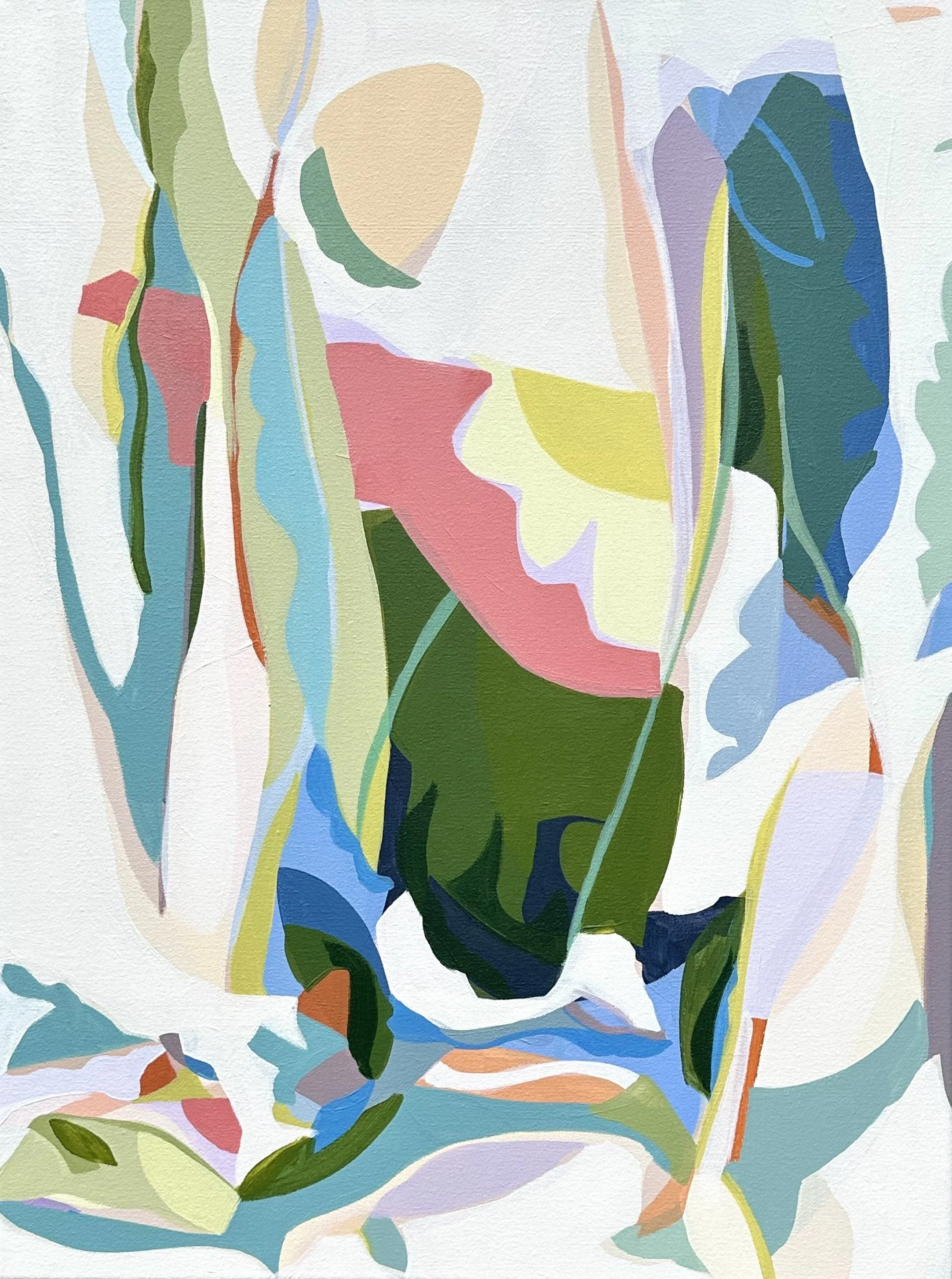
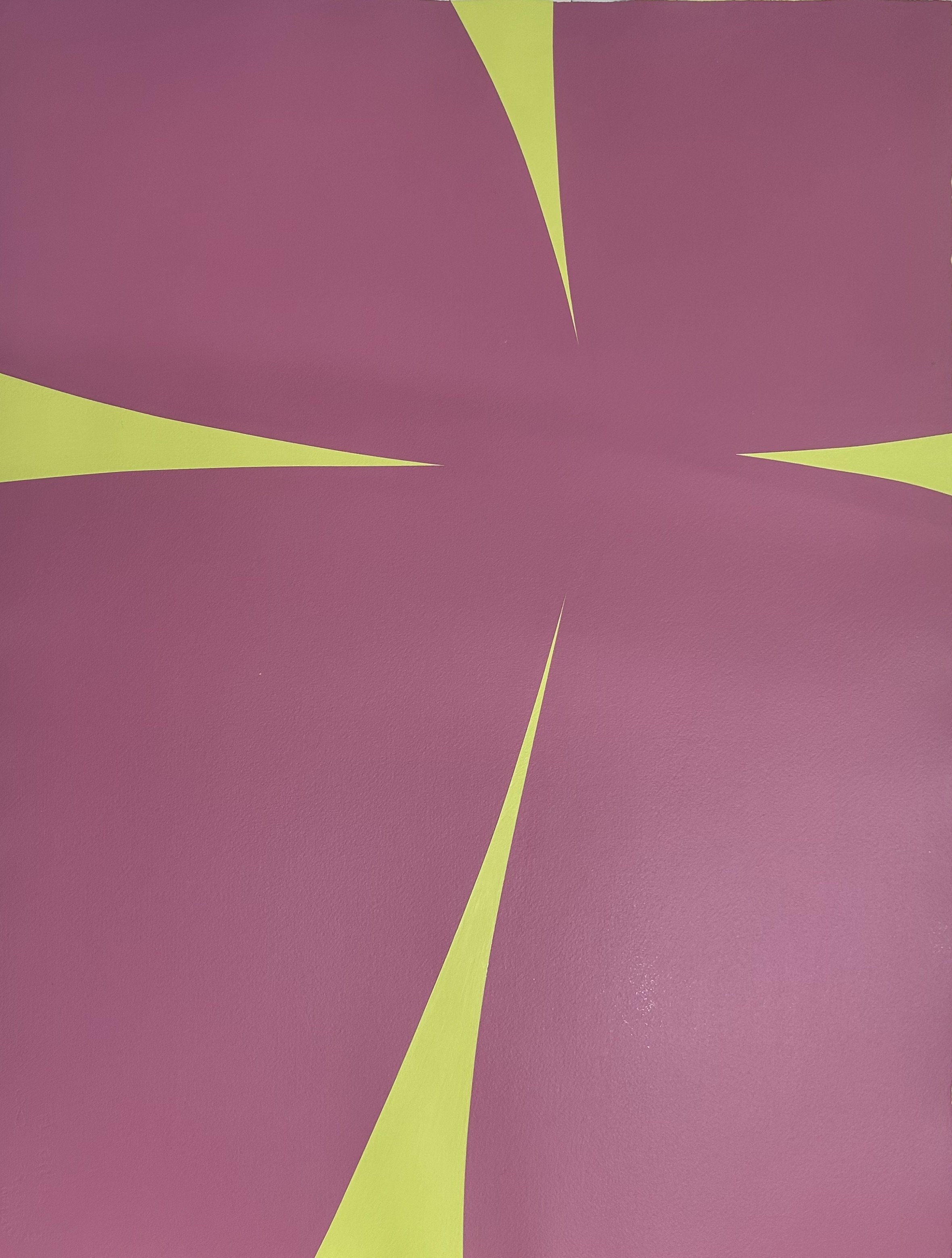
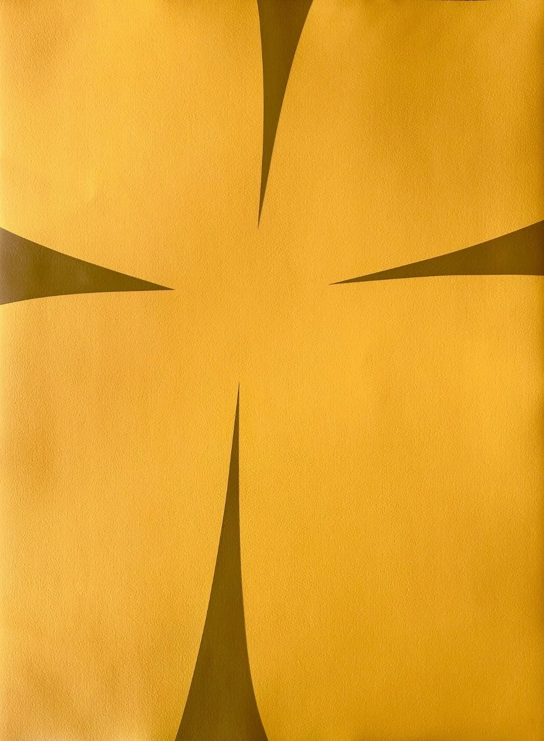
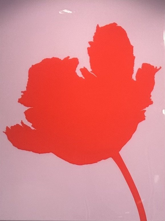
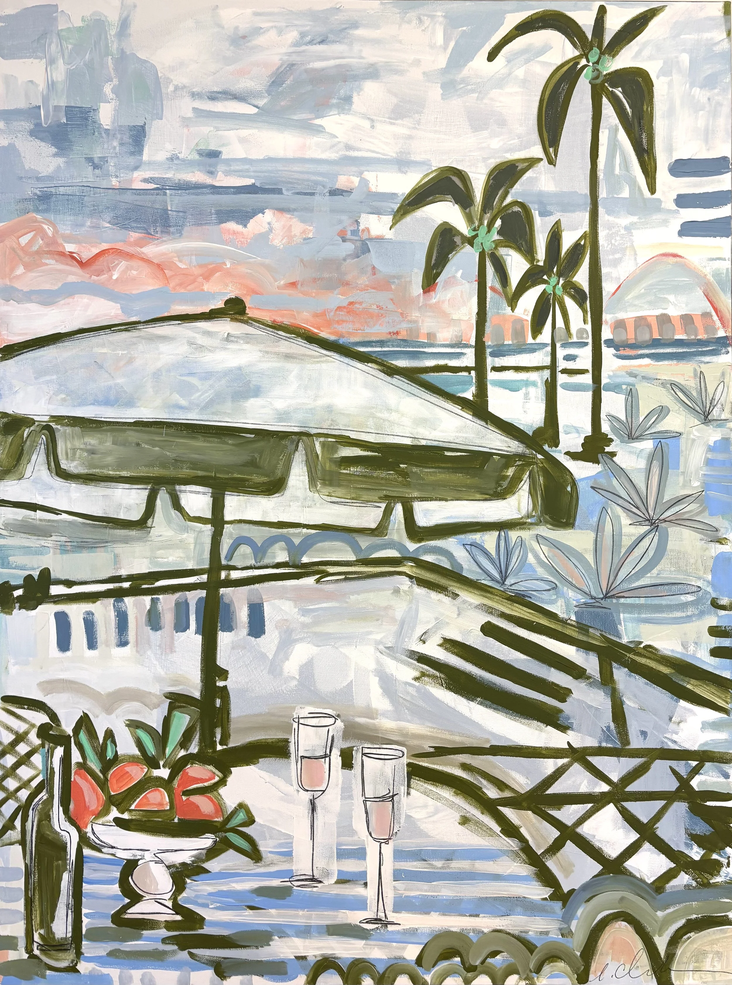
Artwork by Erin McIntosh | Photography by Emily Followill
The foyer opens into the dining room, another space where pink is king and the family's forebears influenced the design. Here, a rather large oil portrait of her husband Caleb's great-aunt Vinny hangs on the back wall, giving the room an air of regality—and informing its color scheme. "I pulled the pink out of her dress and blasted it onto the ceiling and walls," Gross says.
While the portrait is formal, the fuchsia is anything but. "With this fun and playful color, " she explains, "I wanted people to know that we do not take ourselves too seriously."
“Display the things you love, and let your home tell your family’s story.”
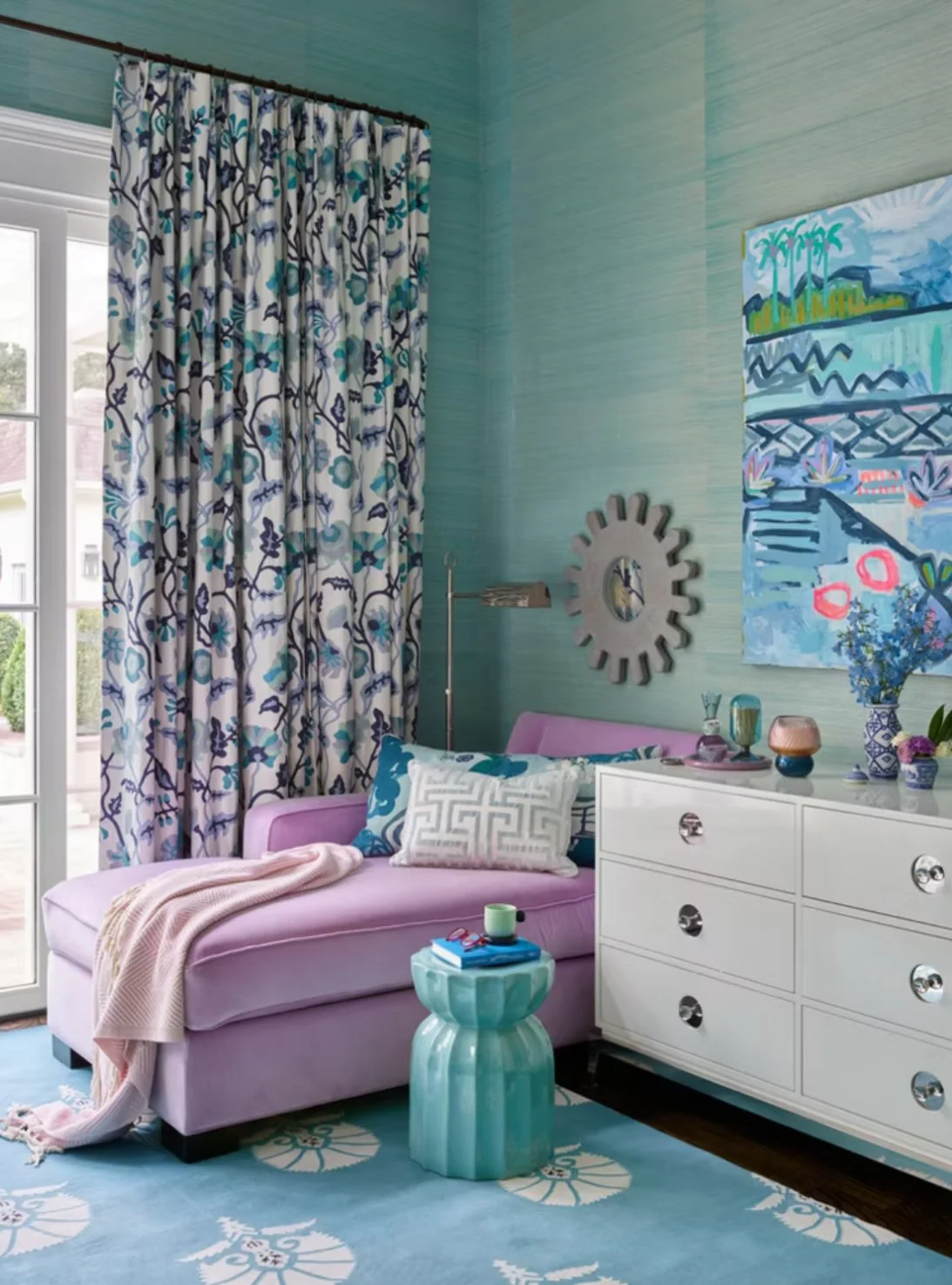
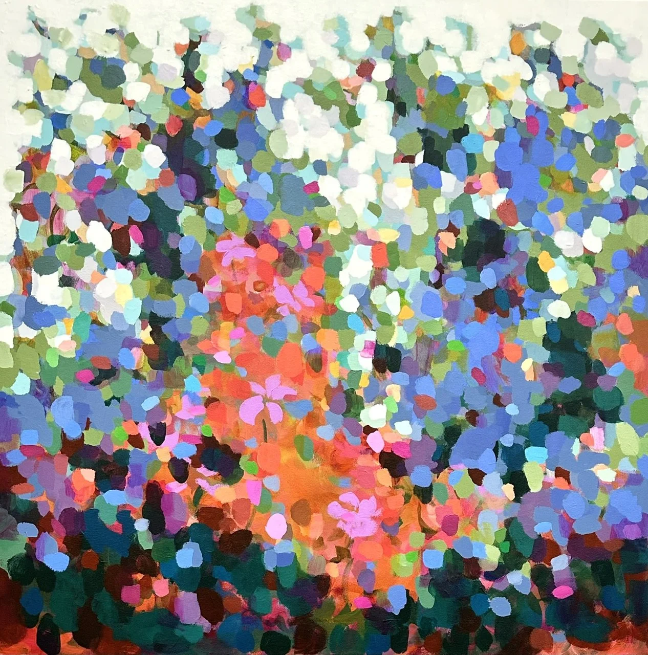
The family room is painted a softer rose shade, but this home is not just a rhapsody in pink; other bold tints, like a canary yellow living break up the signature shade while keeping the energy high. "I have never been a 'yellow' person, but I was craving some exciting energy for that room," Gross explains. "The color draws you into a space that might not otherwise be used as much." There's no artistic ancestor involved here; Gross pulled "the brightest yellow" from a Manuel Canovas pattern on a banquette she already had and carried it over to the walls and ceiling to create what she calls "a fun, lively room that people gravitate toward."

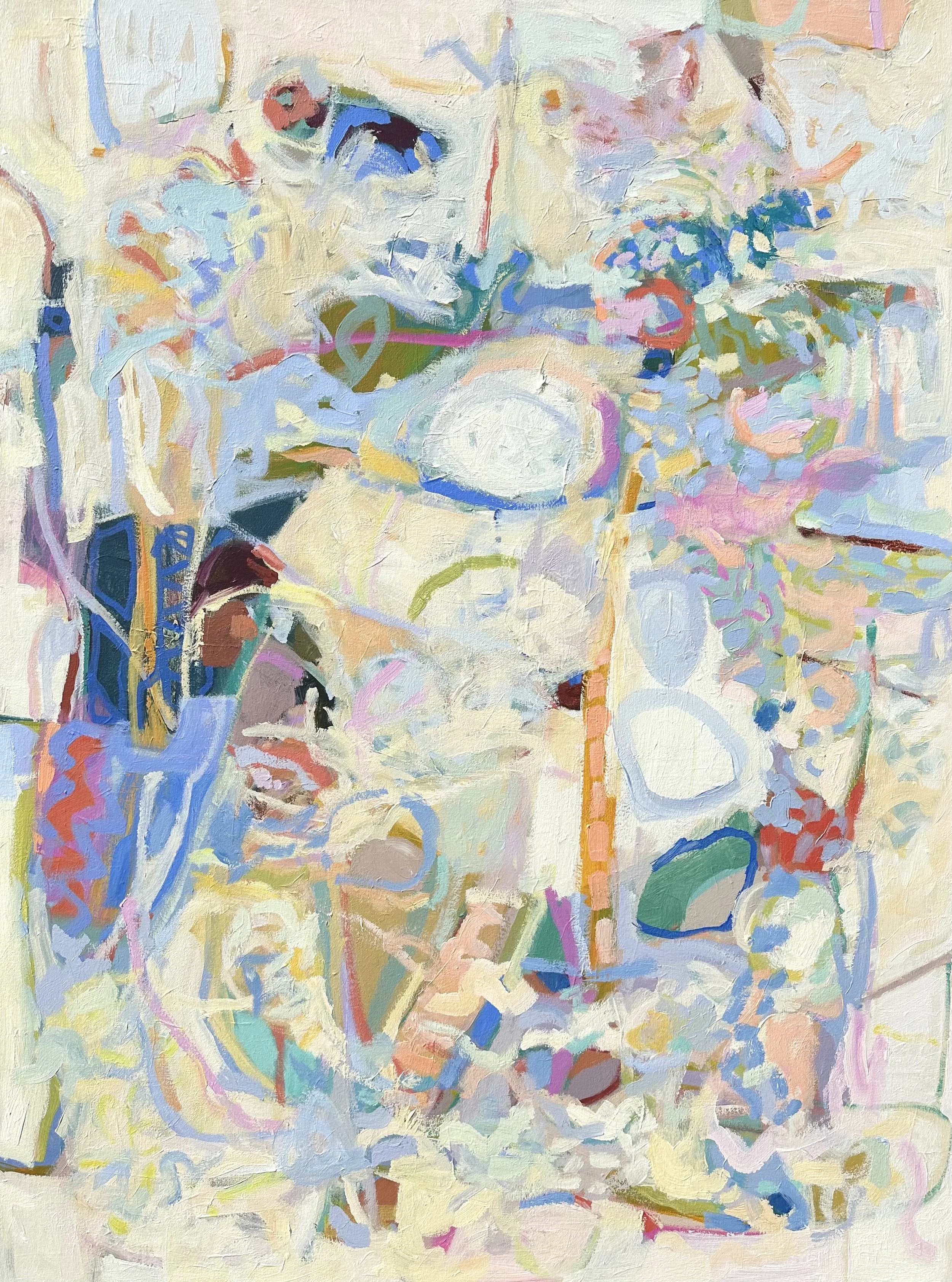
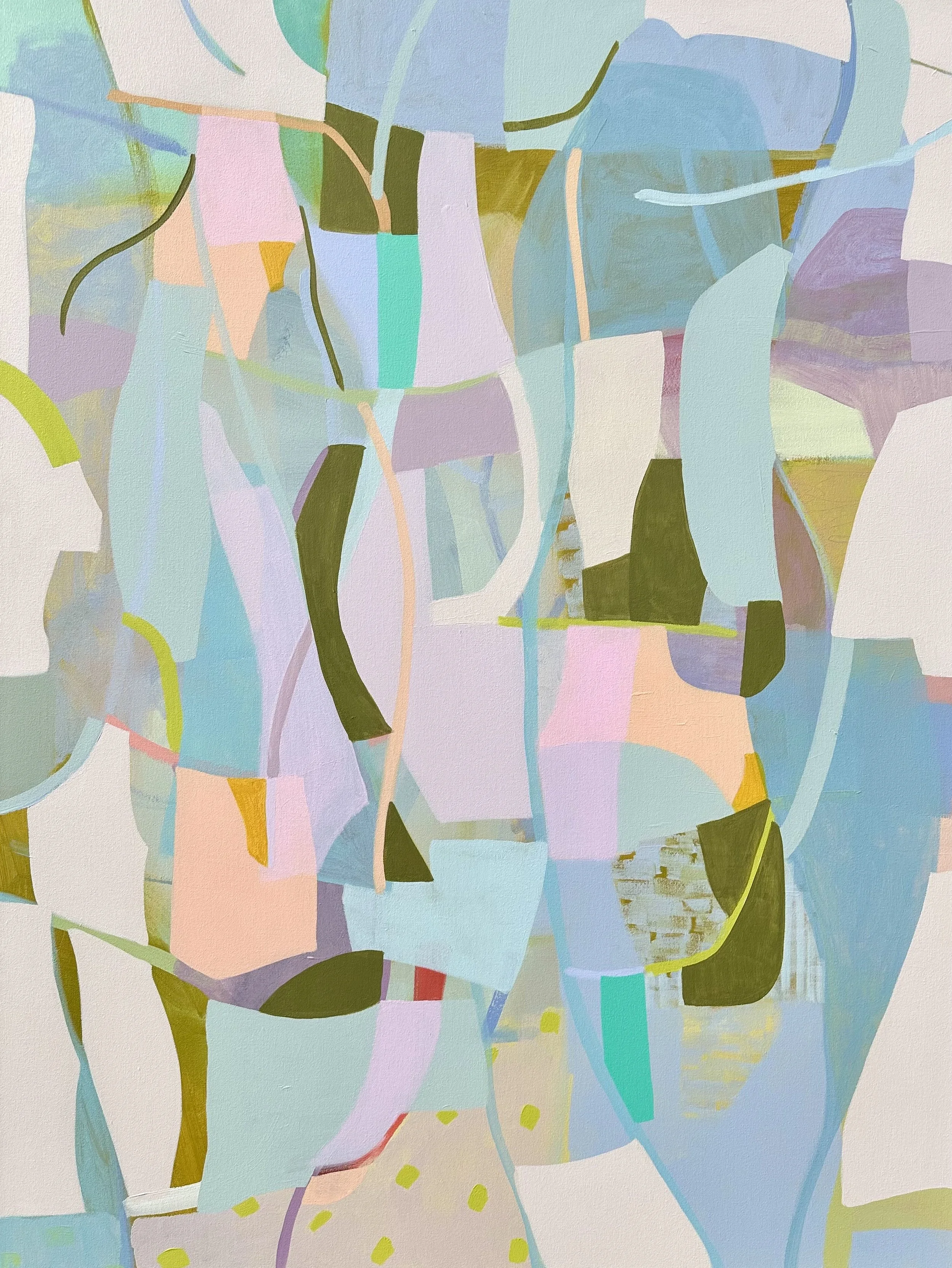
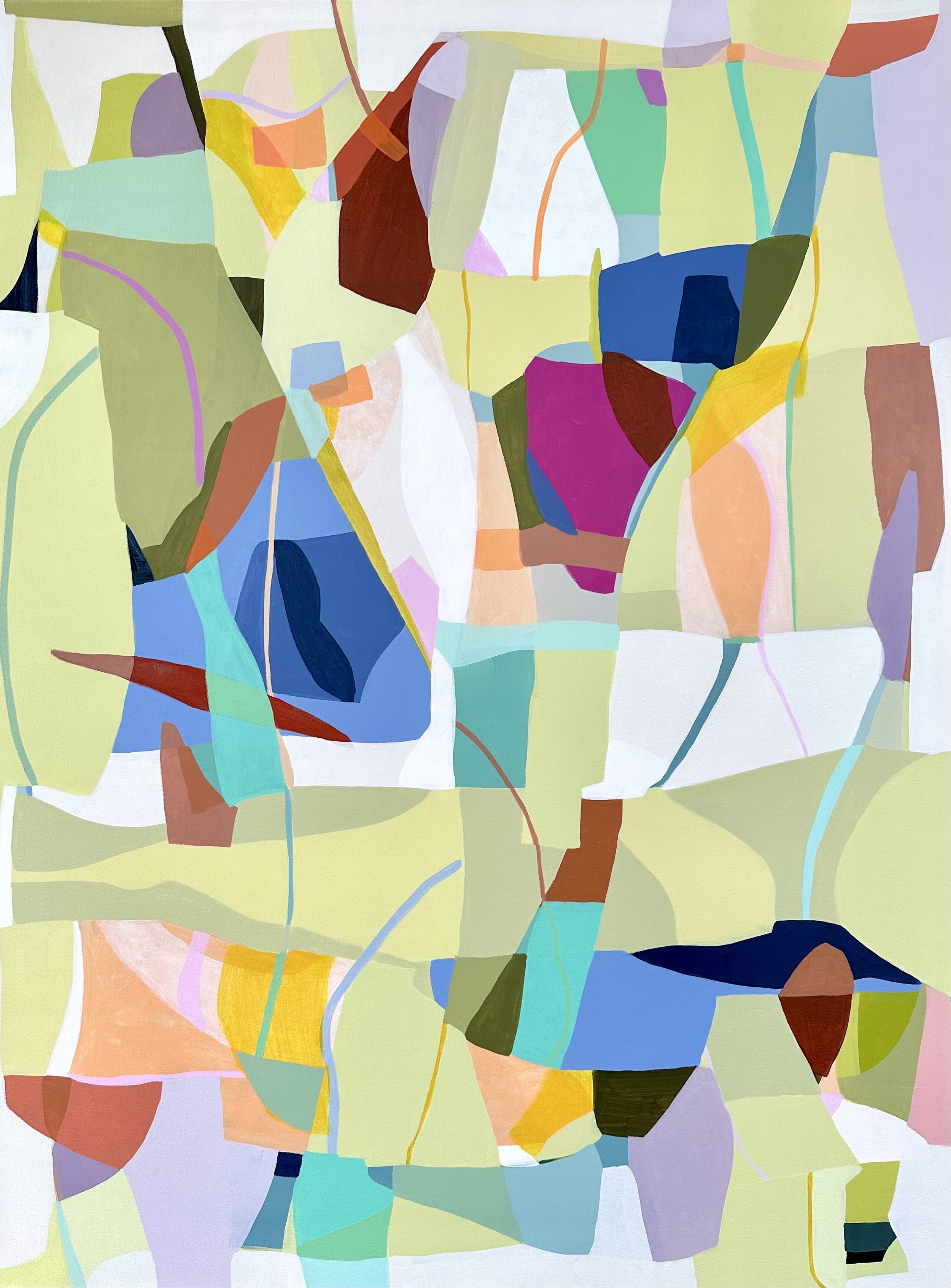
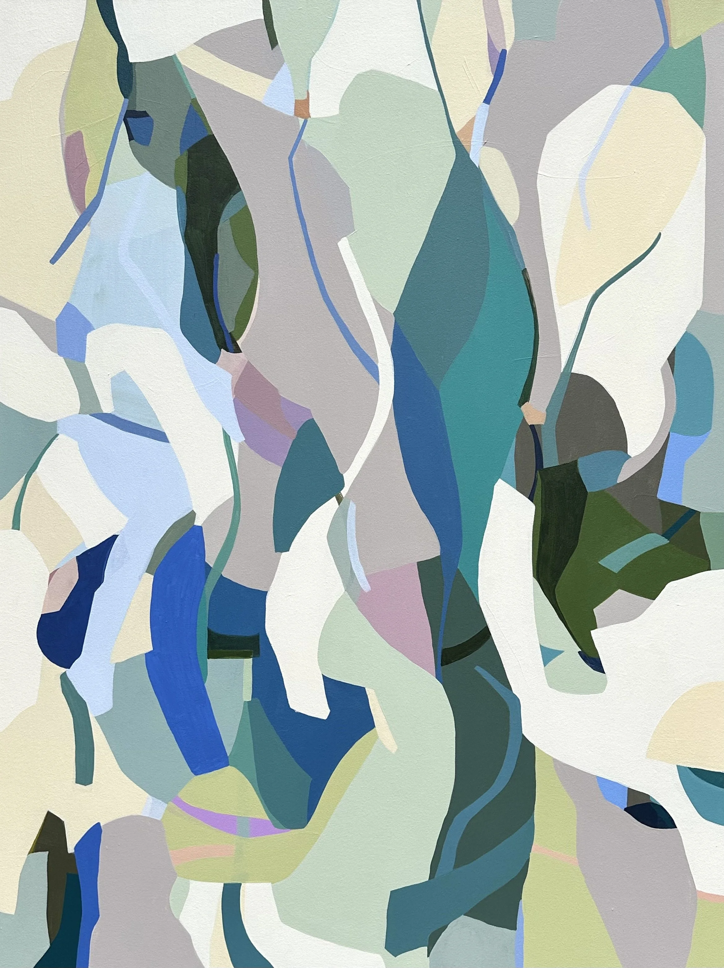
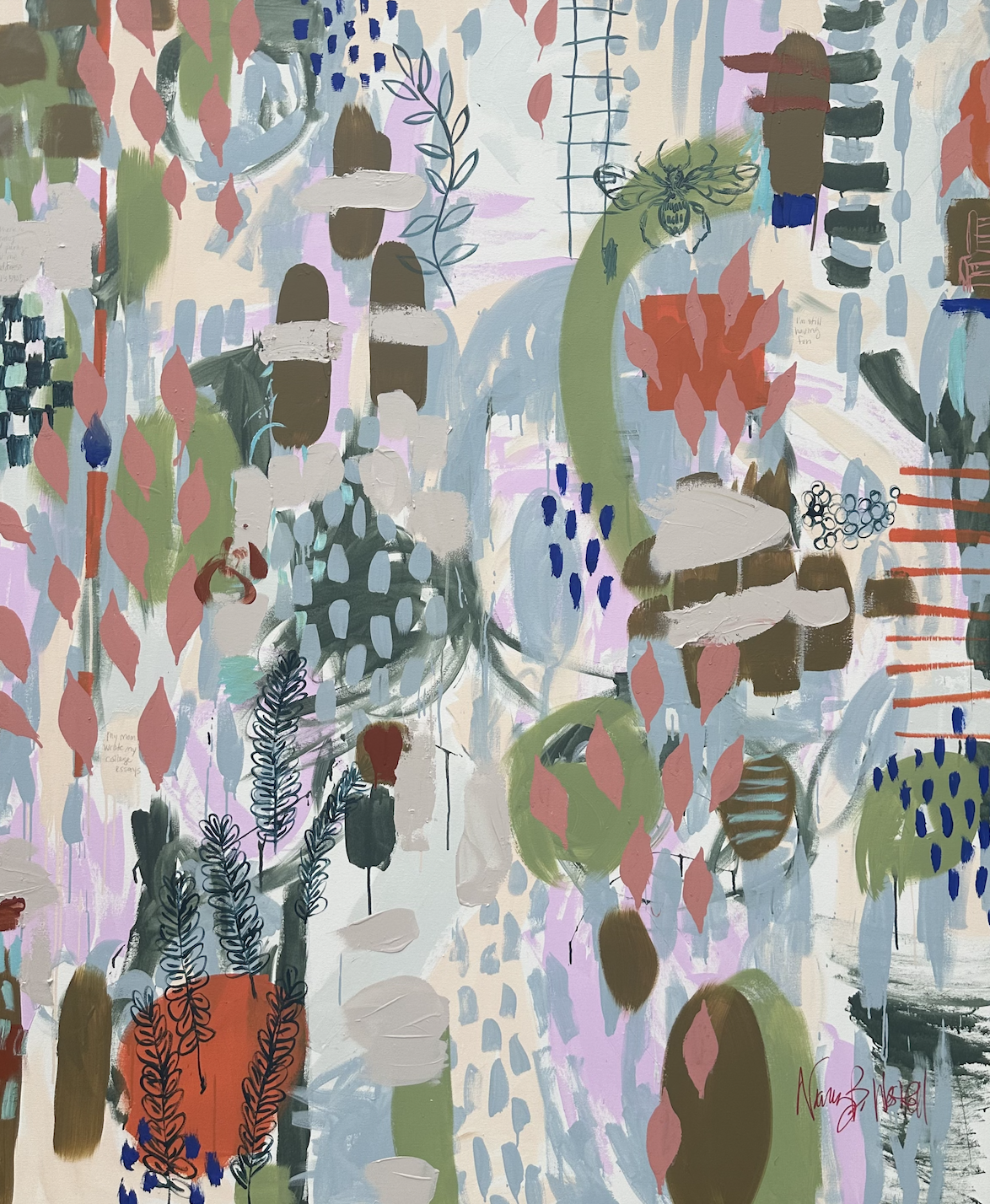
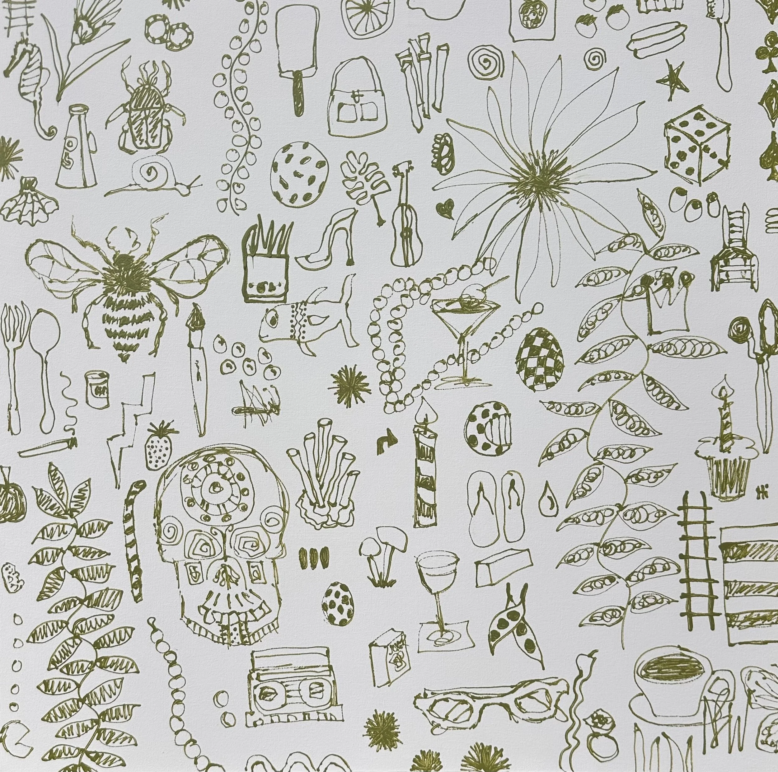
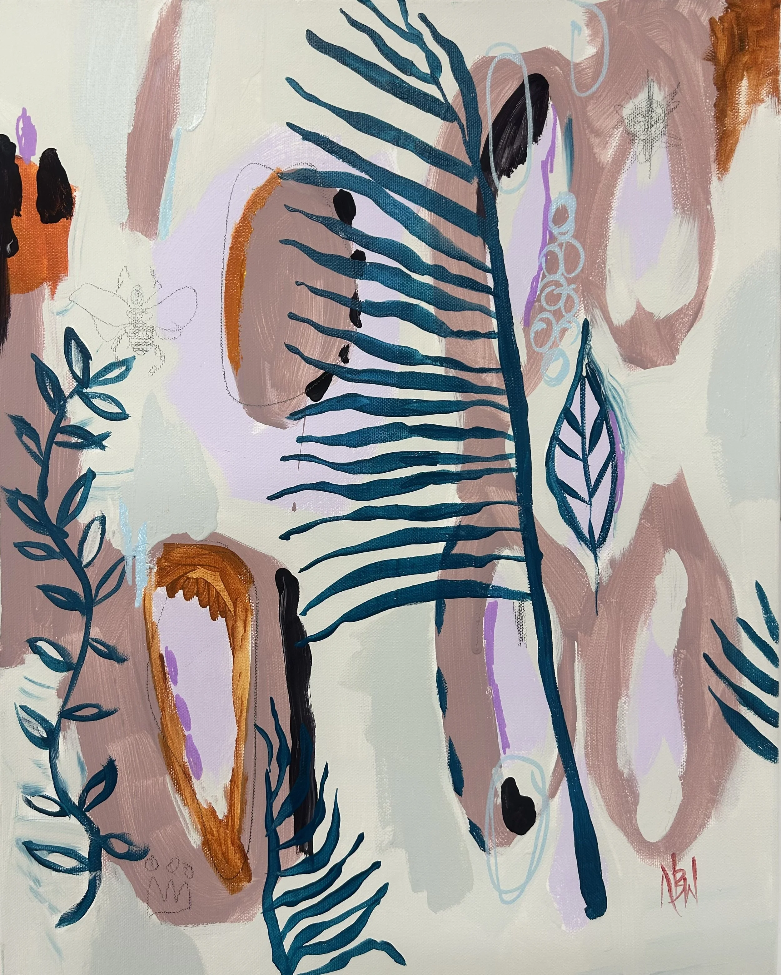
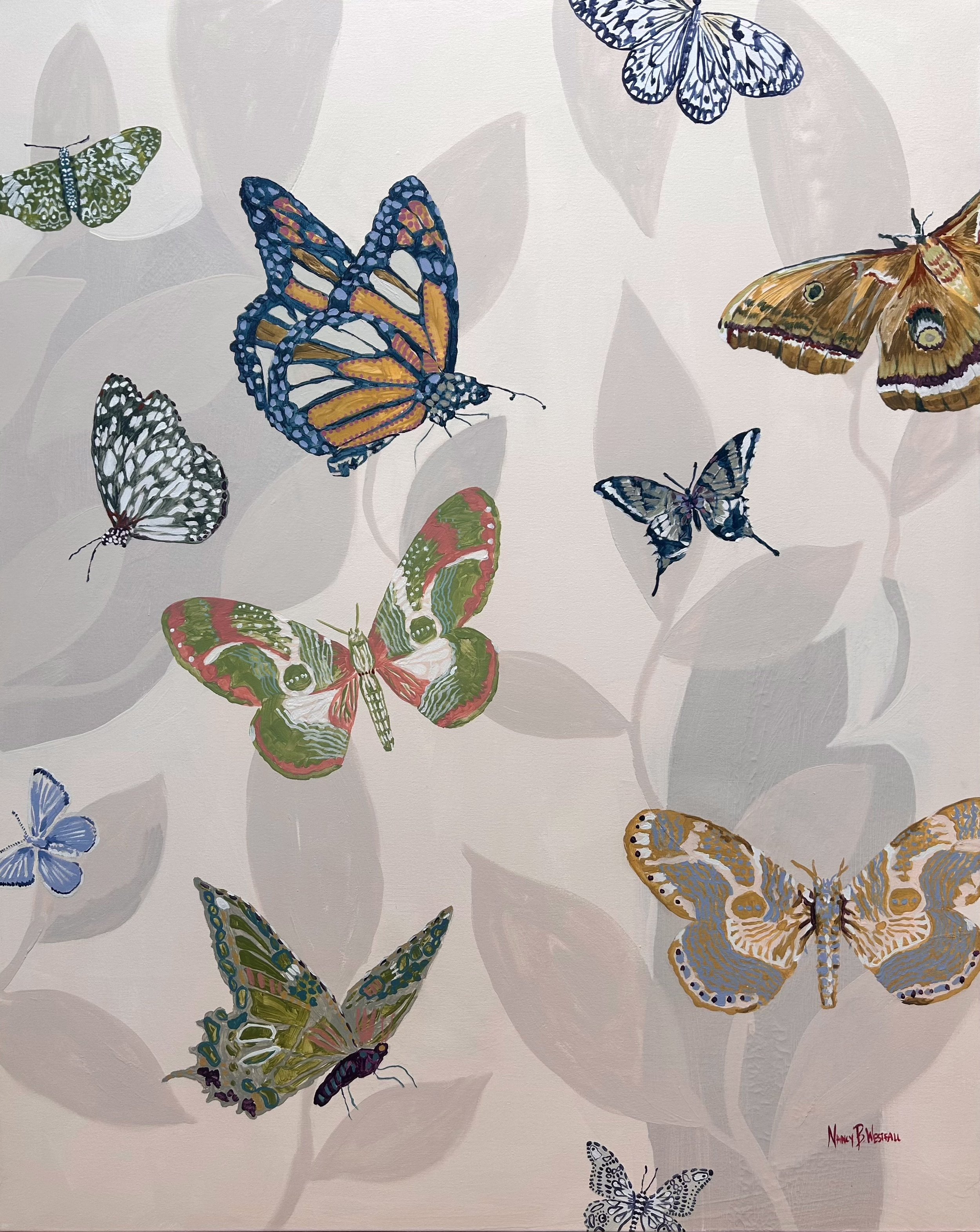
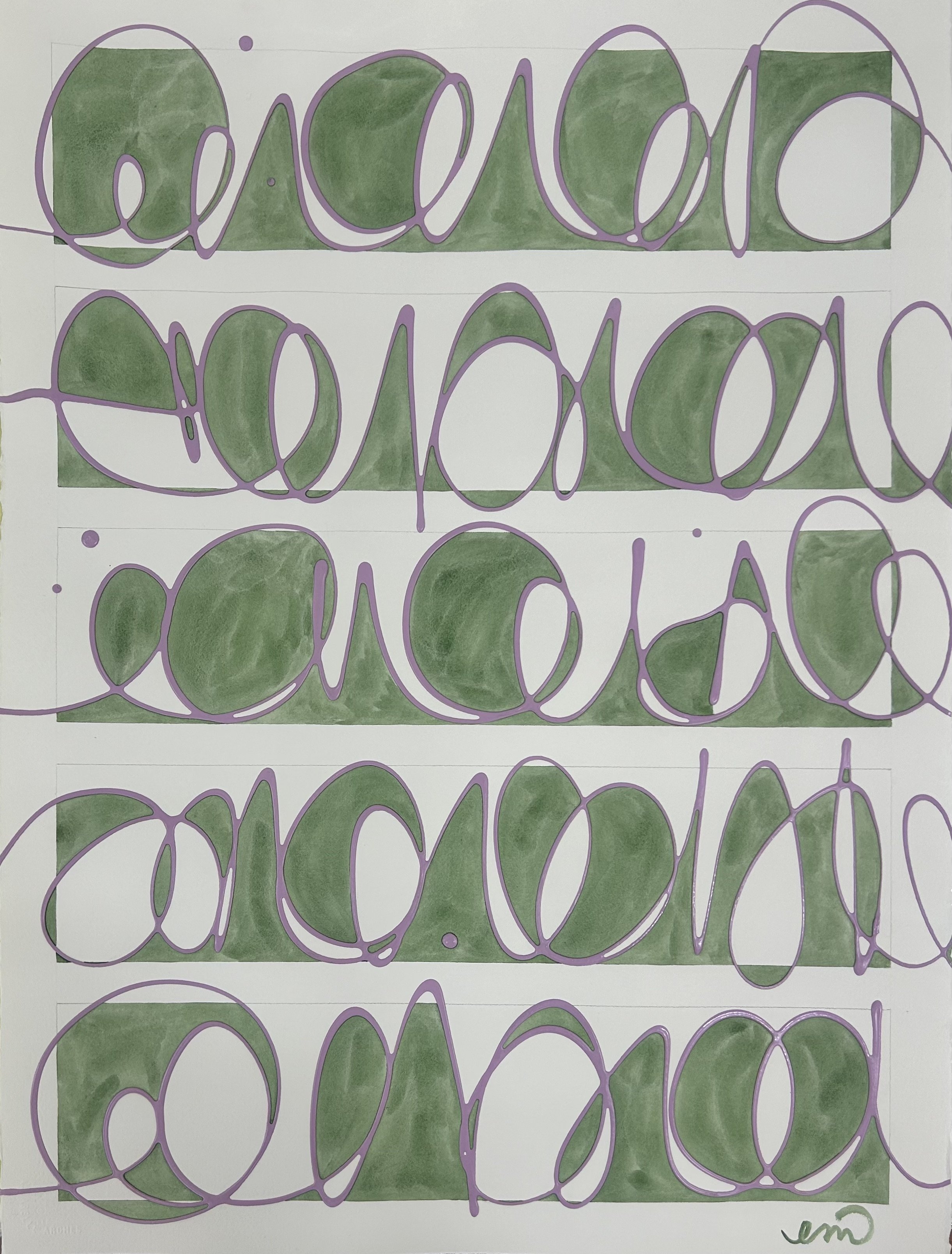
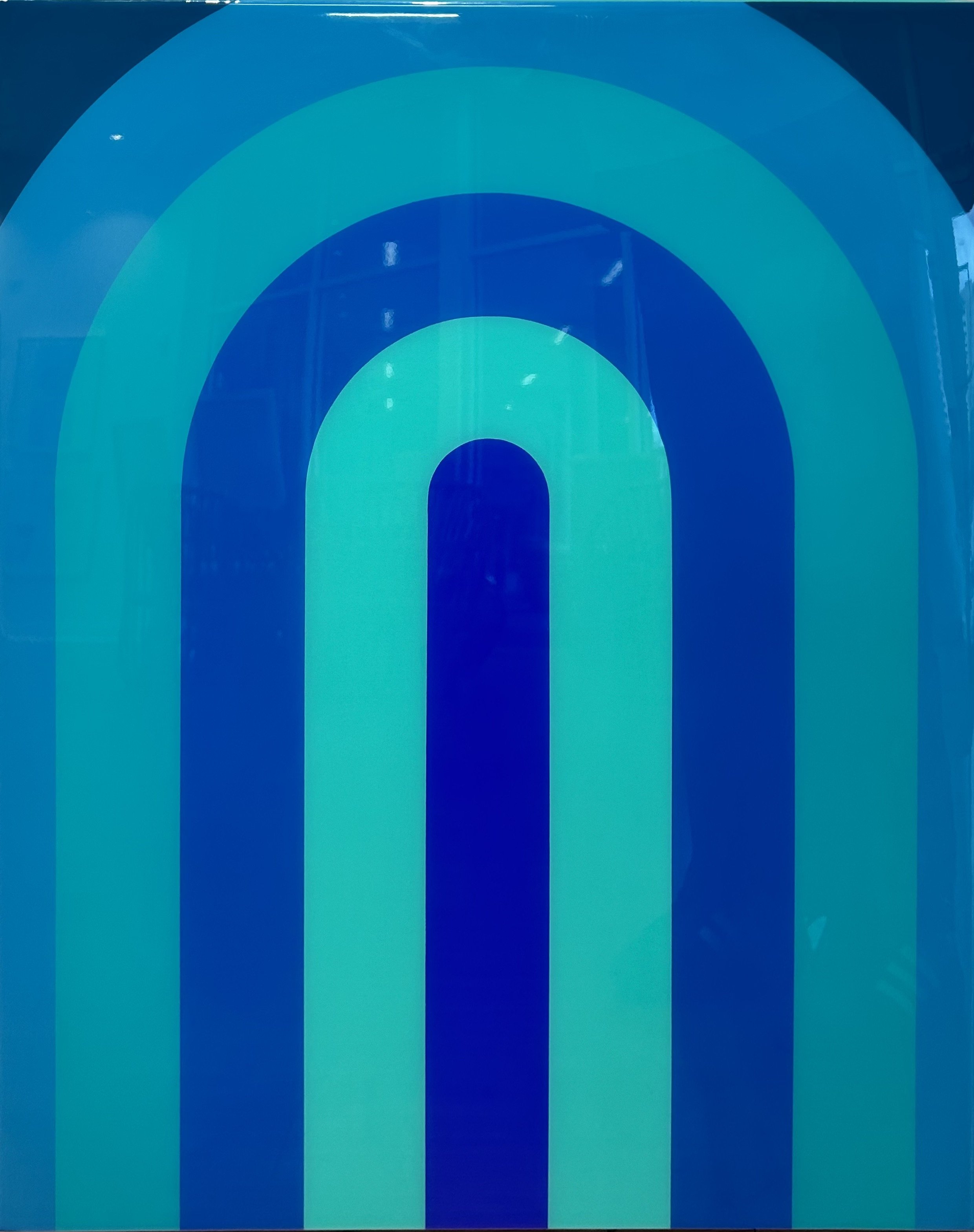
Artwork by Nancy B. Westfall (L) and Evan Mooney (R) | Photography by Emily Followill
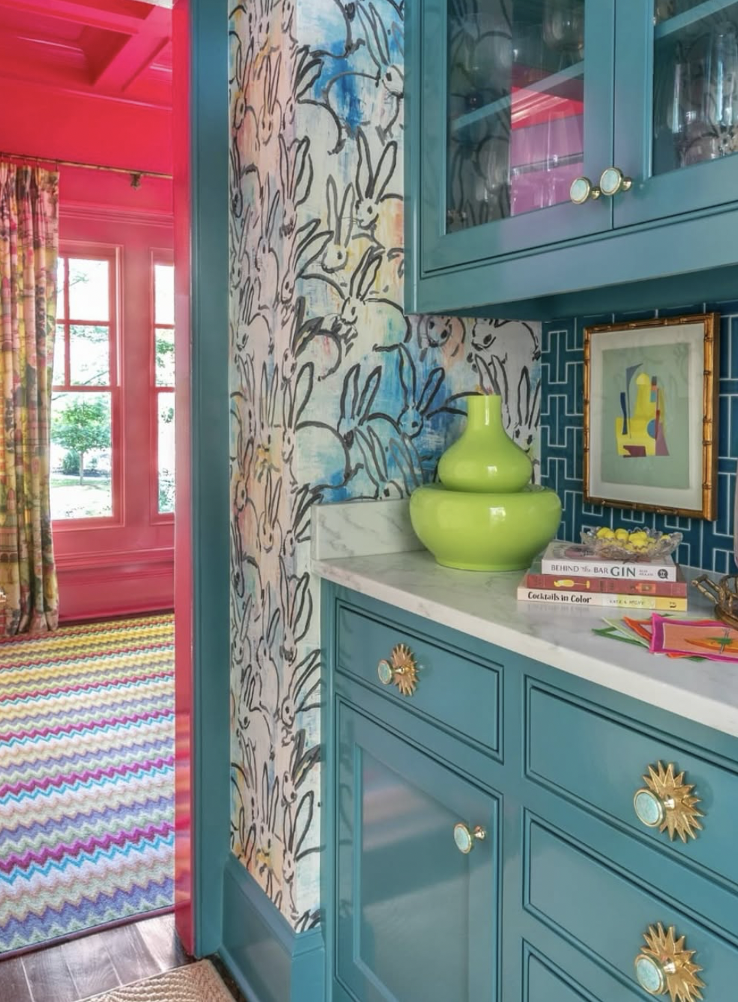
The only room in the 4,000-square-foot home that isn't drenched in a bright color is the white kitchen, a spot that Gross kept serene and functional by design. "As much as I love color, I also love a white kitchen,” Gross says. "It's where we cook, work, and play, and the white is such a good canvas for that." The exception is the custom tile backsplash in two shades of ocean blue, which Gross worked into every room of the house. "I picked those colors and used them in little doses to make the rooms flow easily," she explains.
While a vibrant use of color obviously runs in the family, Gross is happy to report that she's seeing bold hues growing in popularity with her clients, too. "People are realizing that color makes you feel good! Even minimalists are embracing color, and all of my clients are asking for it," she says. "I am so happy to say that color is back—but did it ever really go away?"
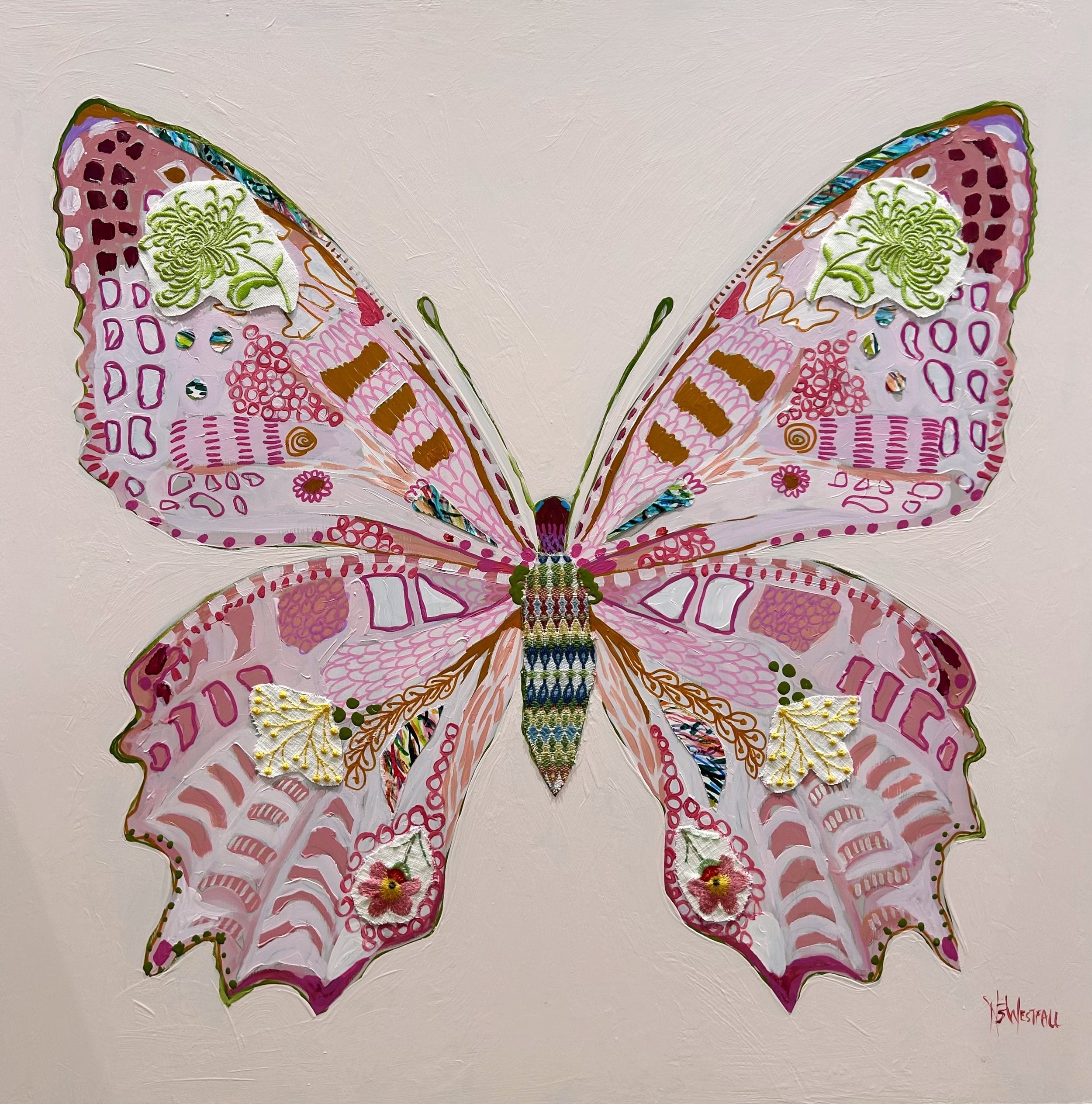
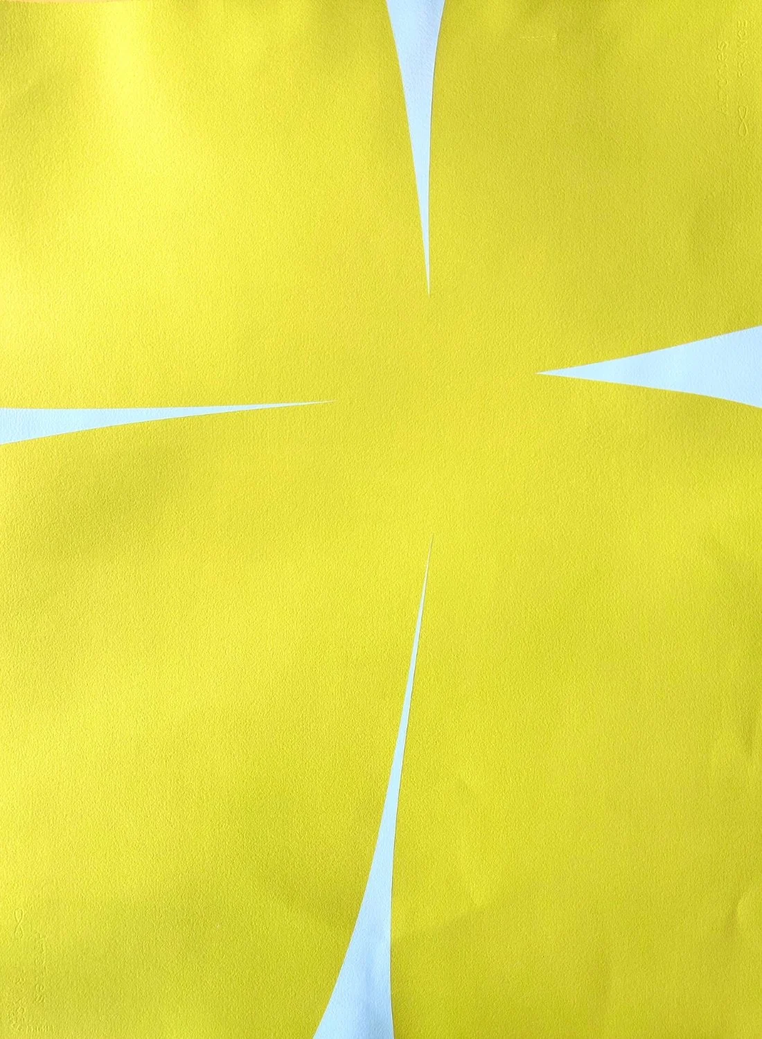
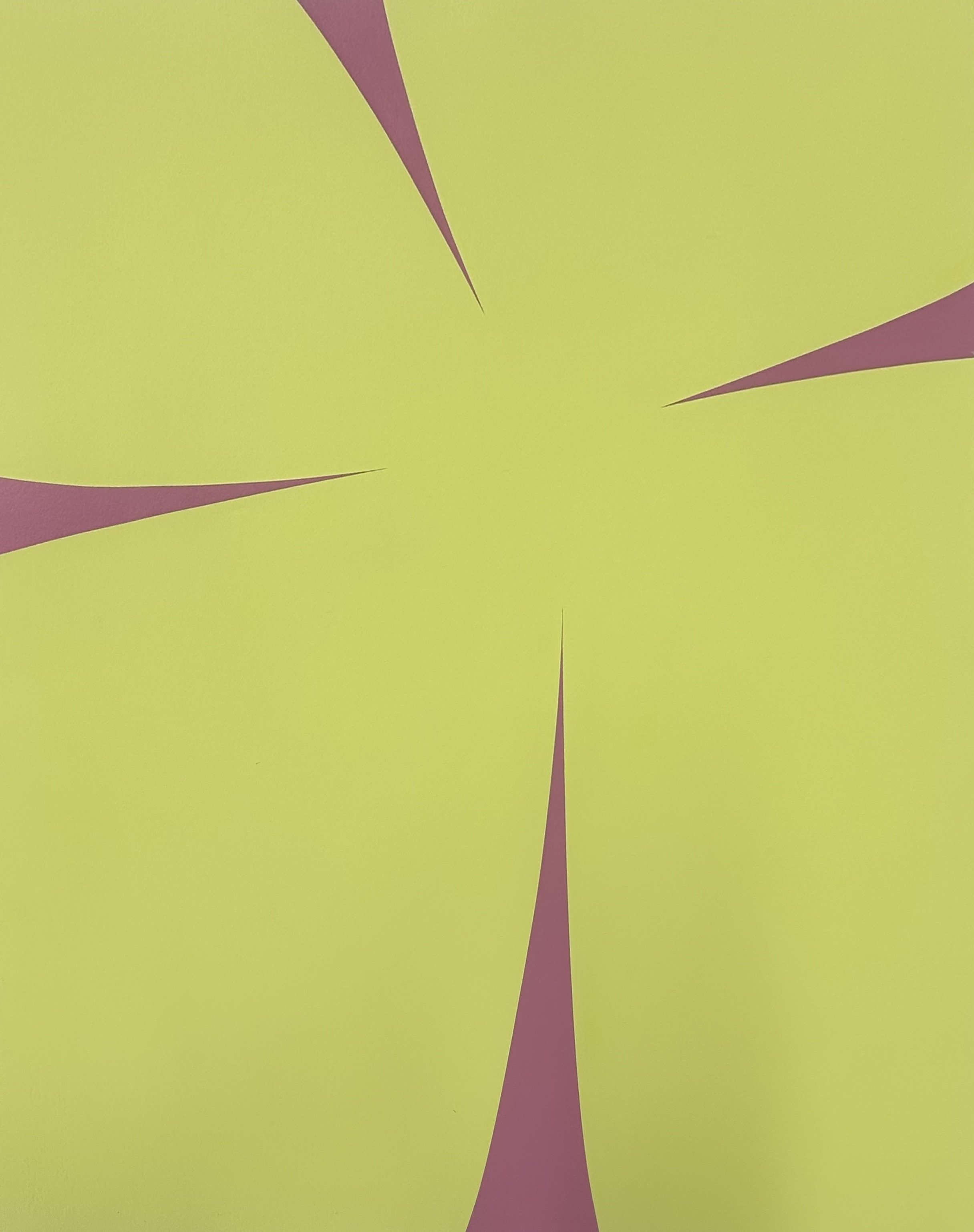
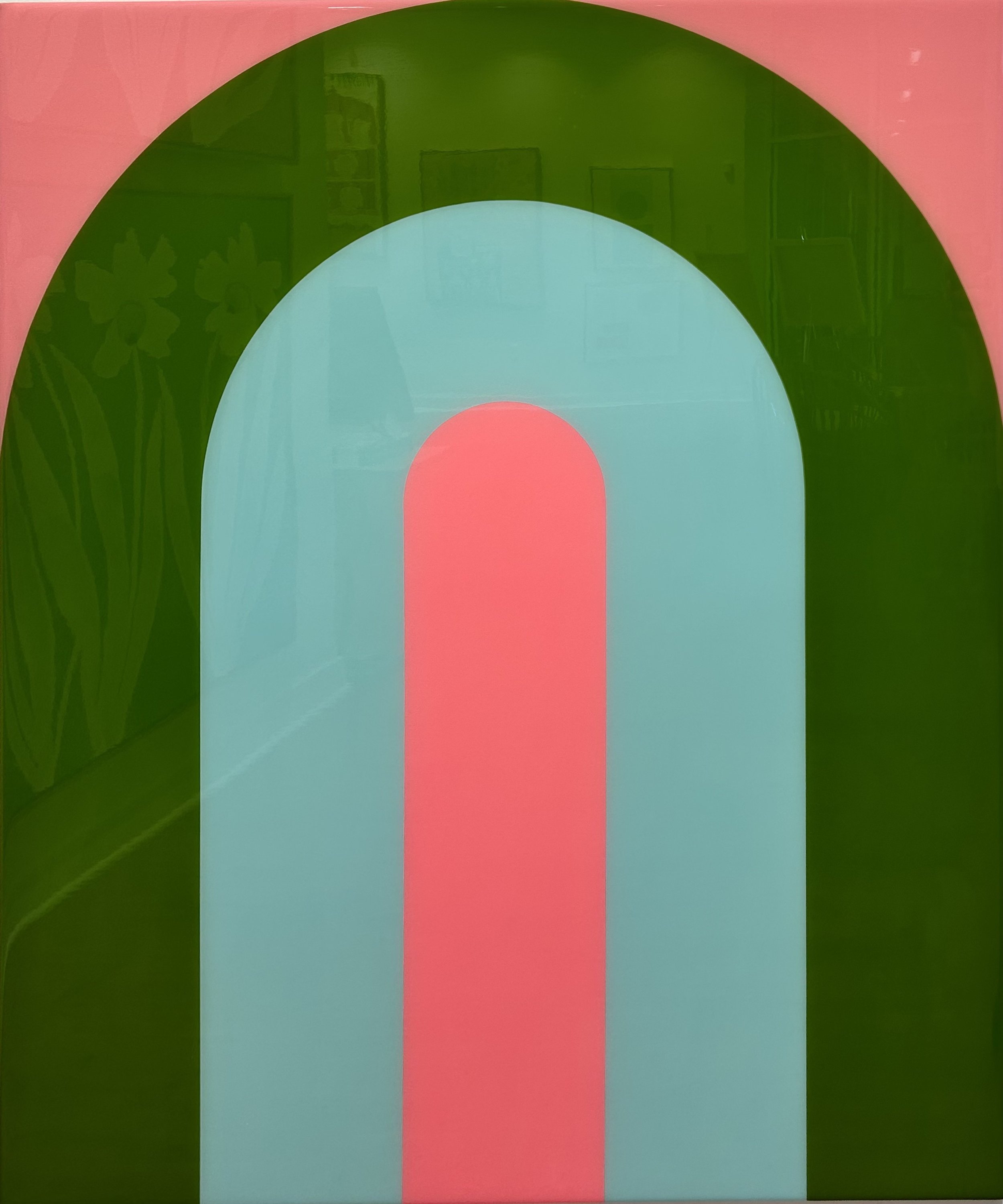
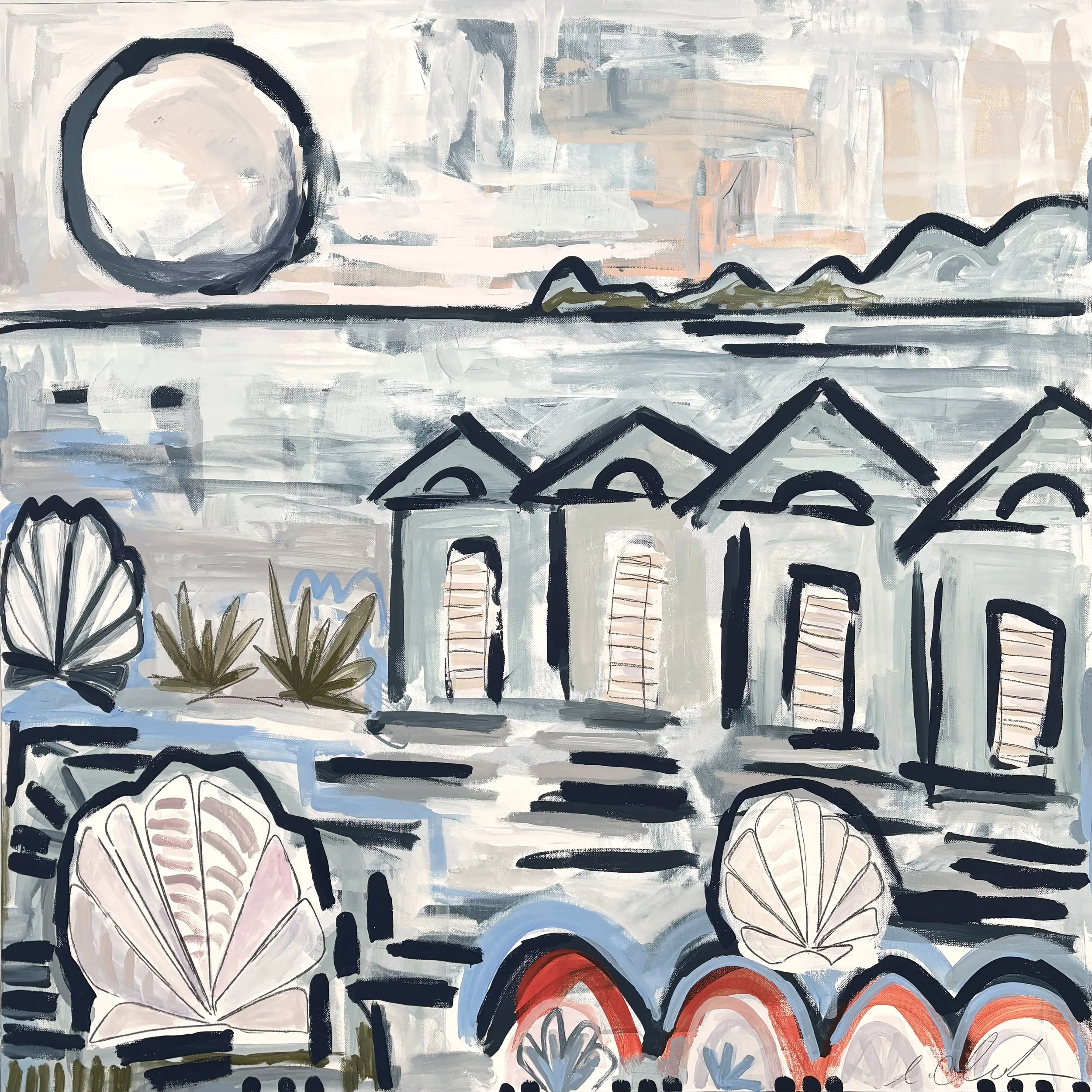
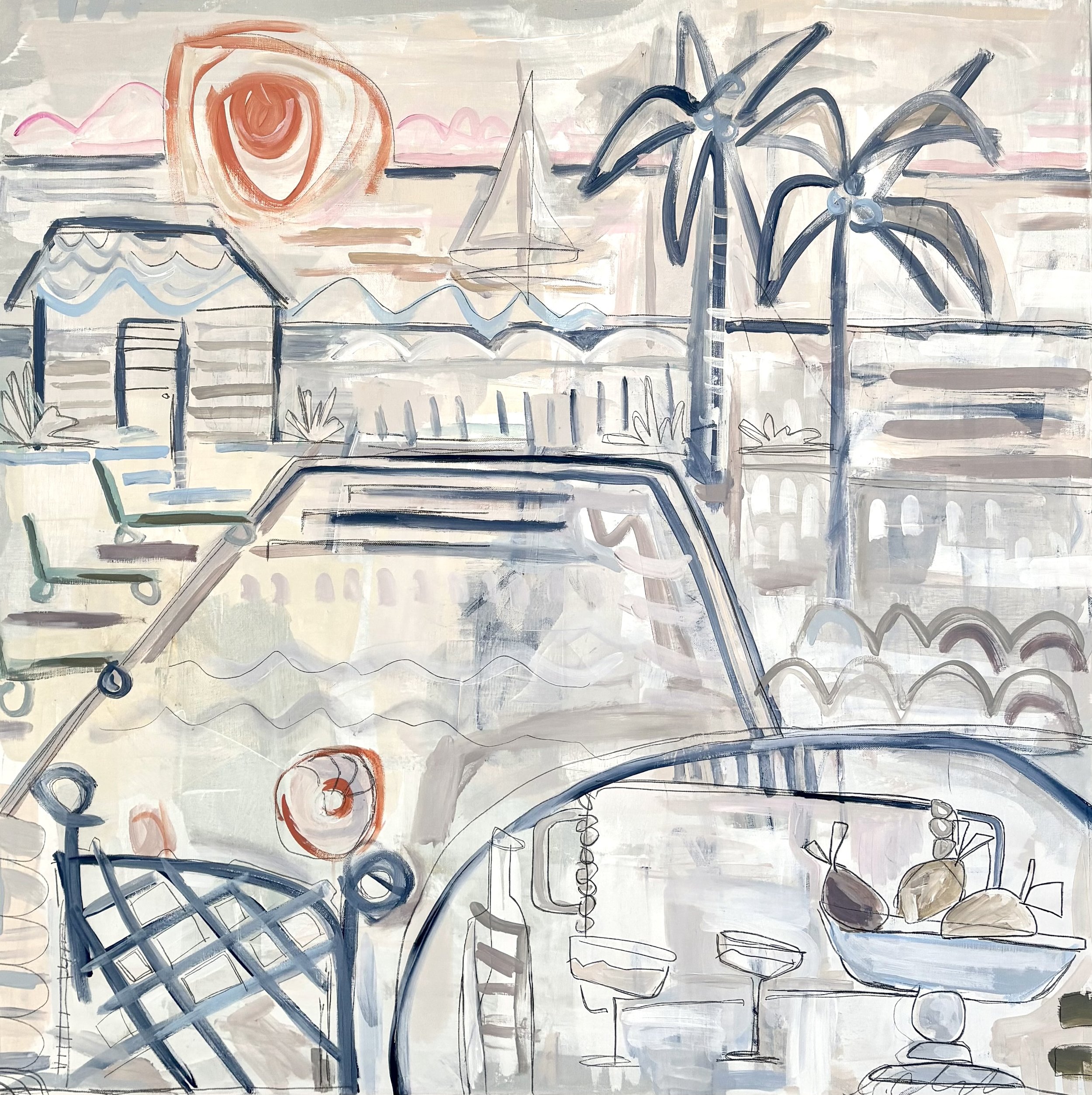
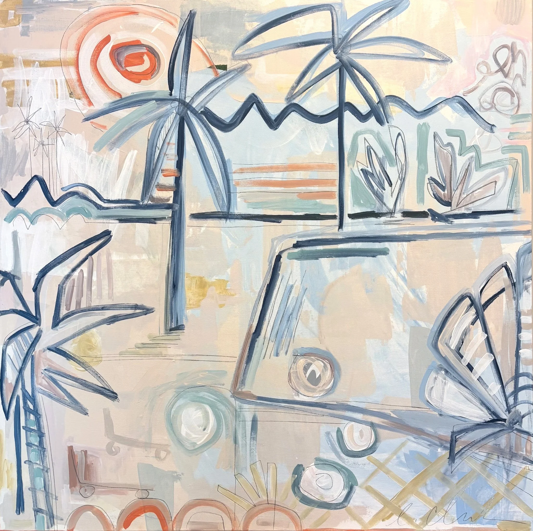
Artwork by Erin Clark | Photography by Emily Followill
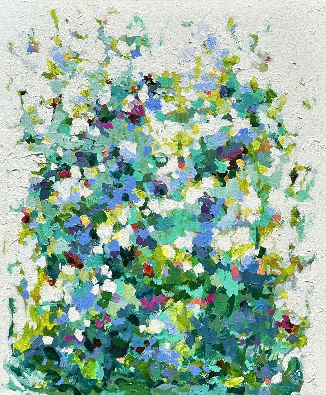
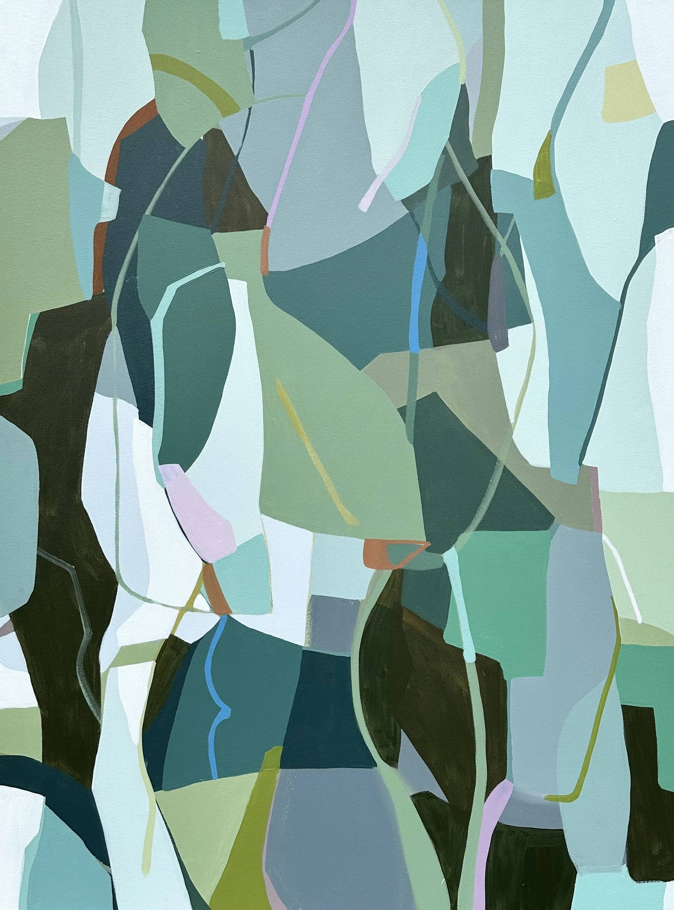

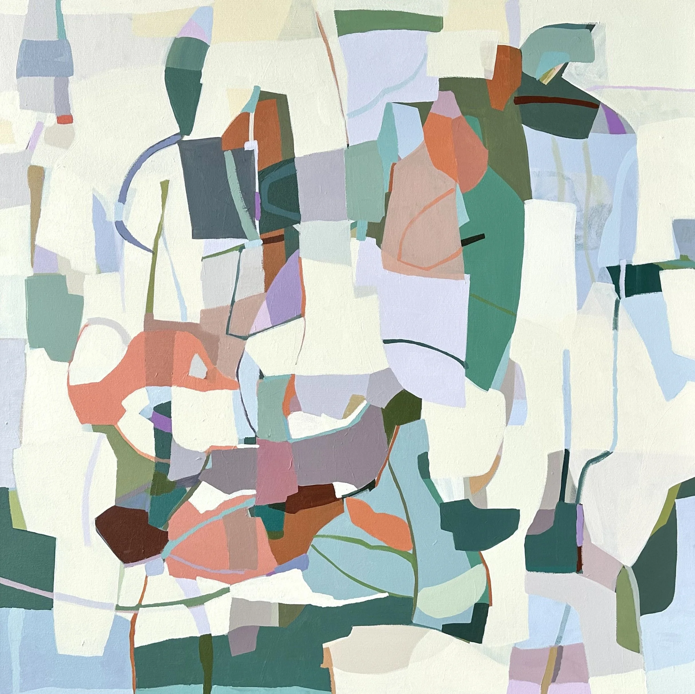

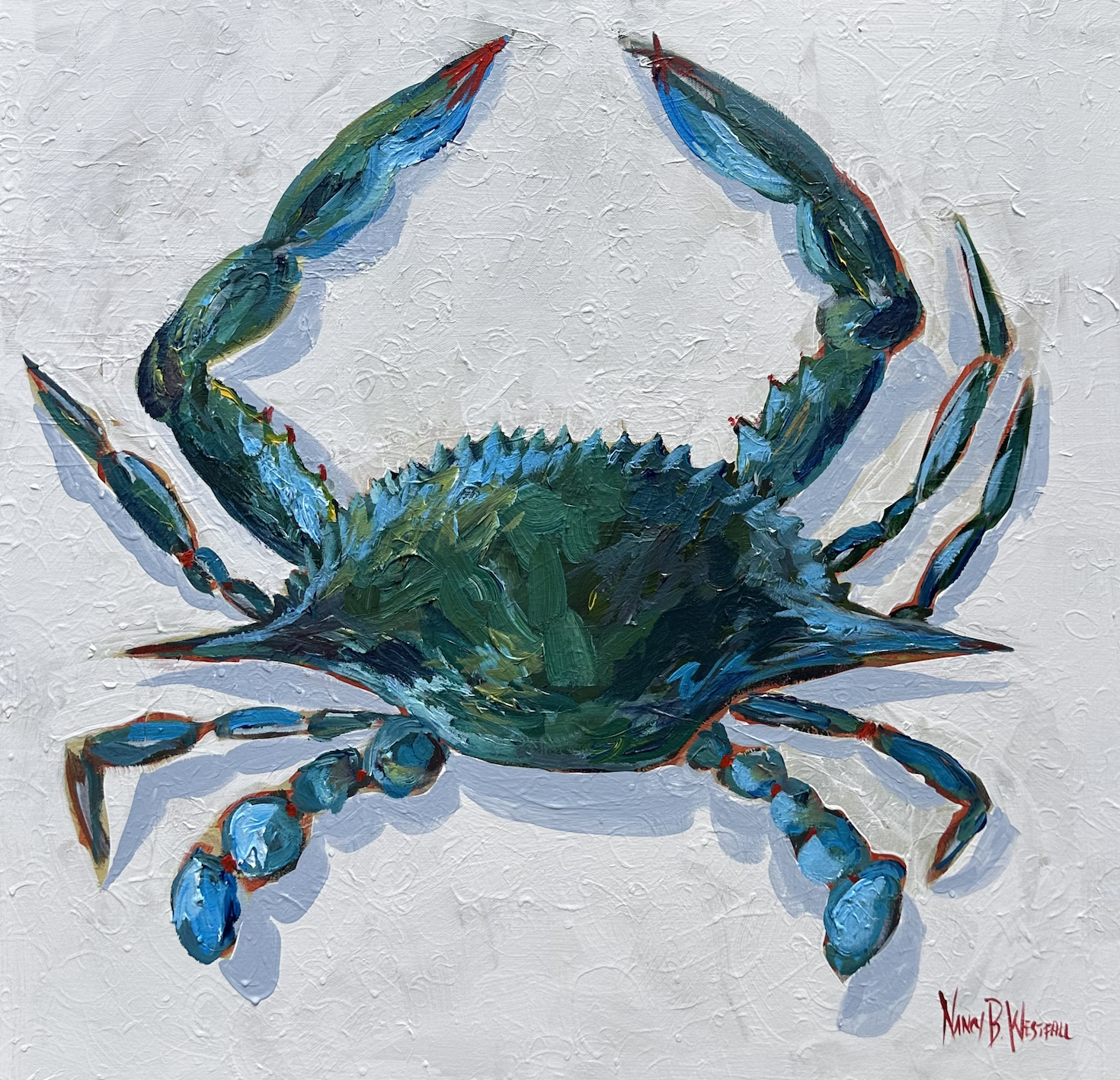

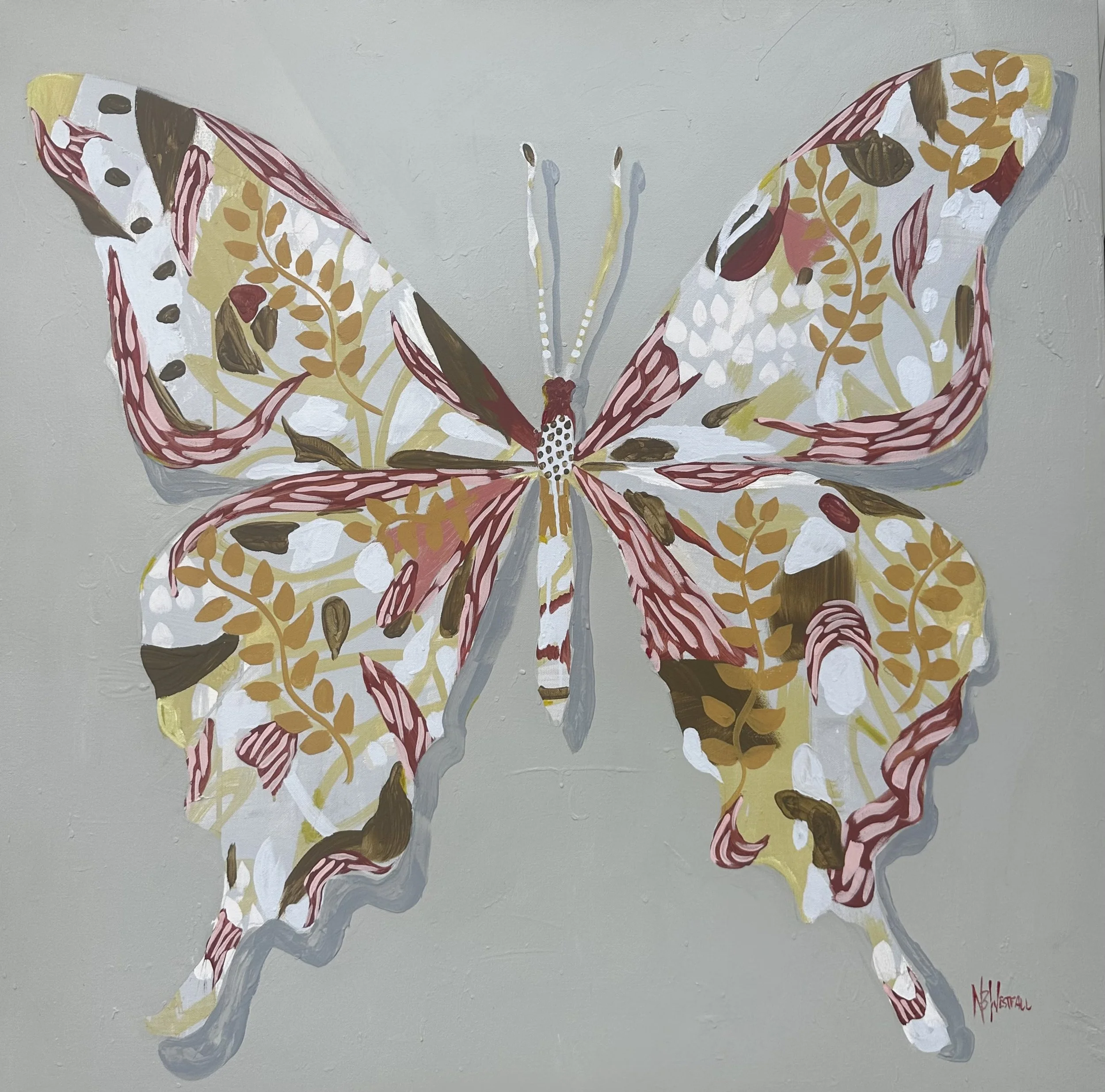
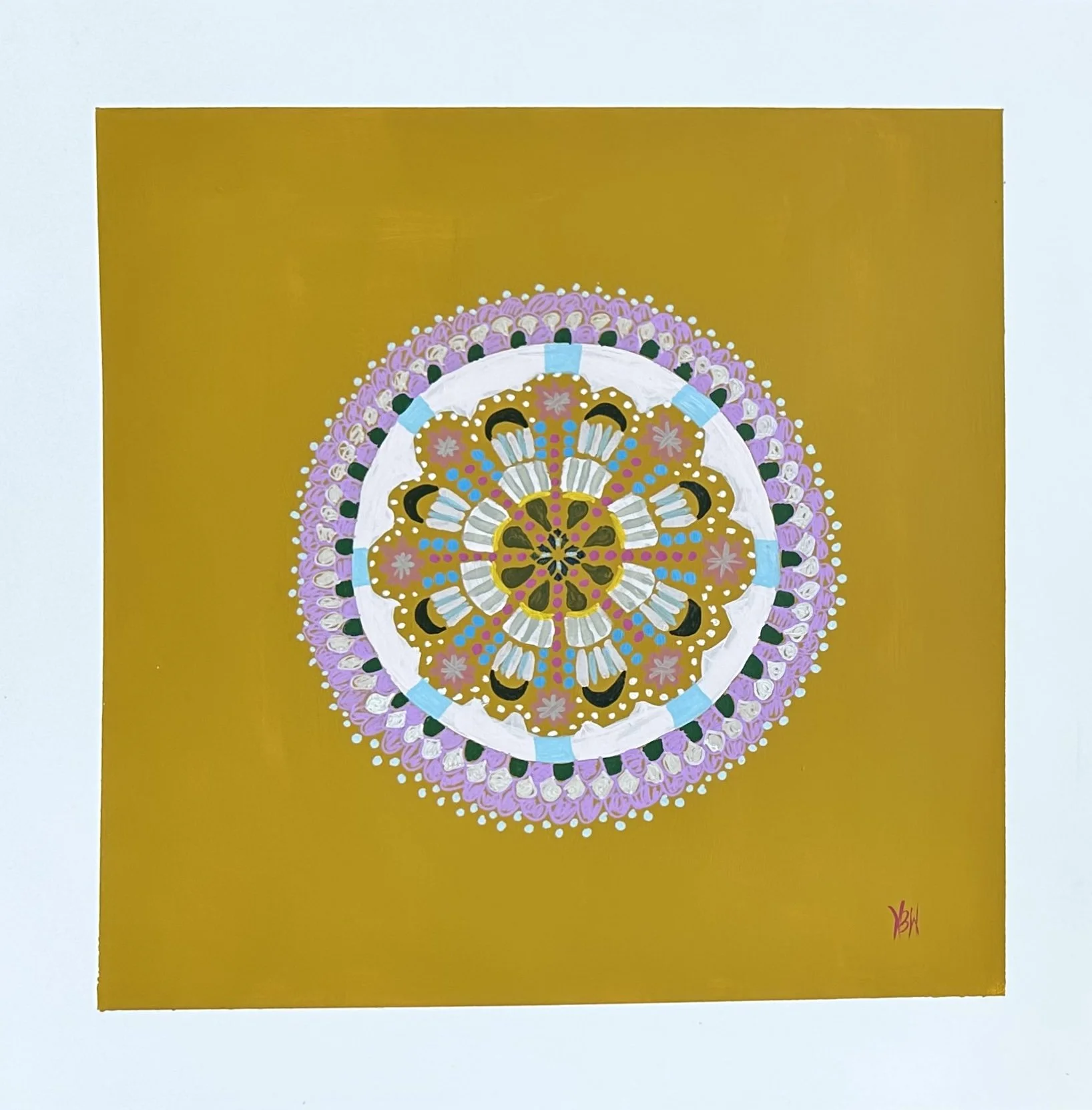


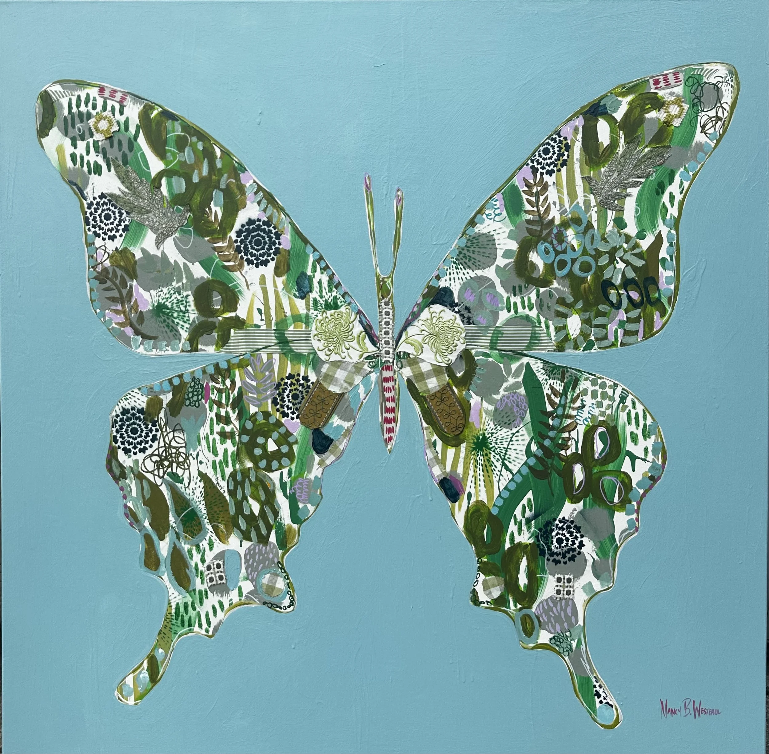

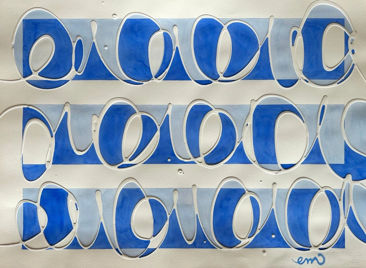
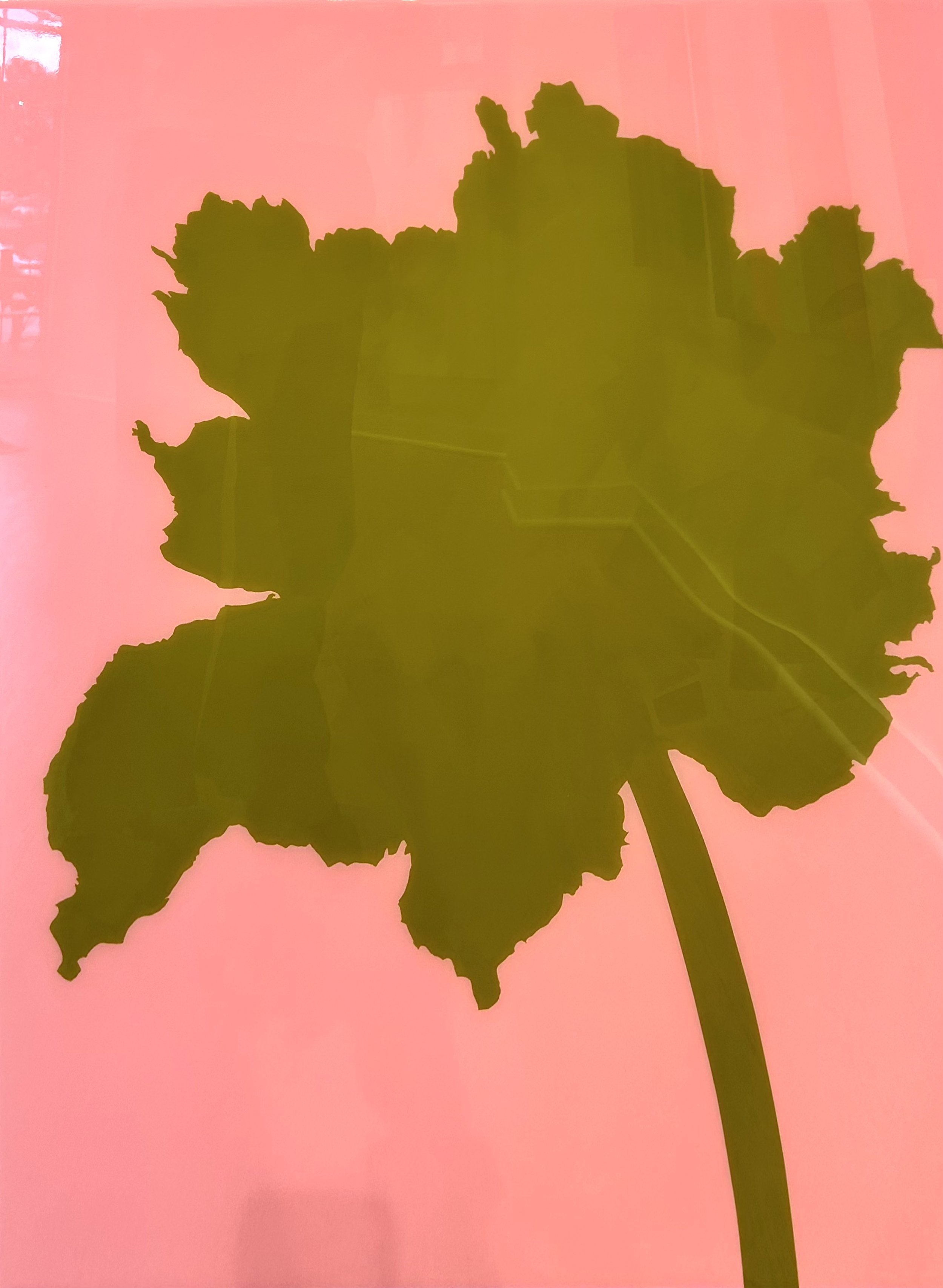
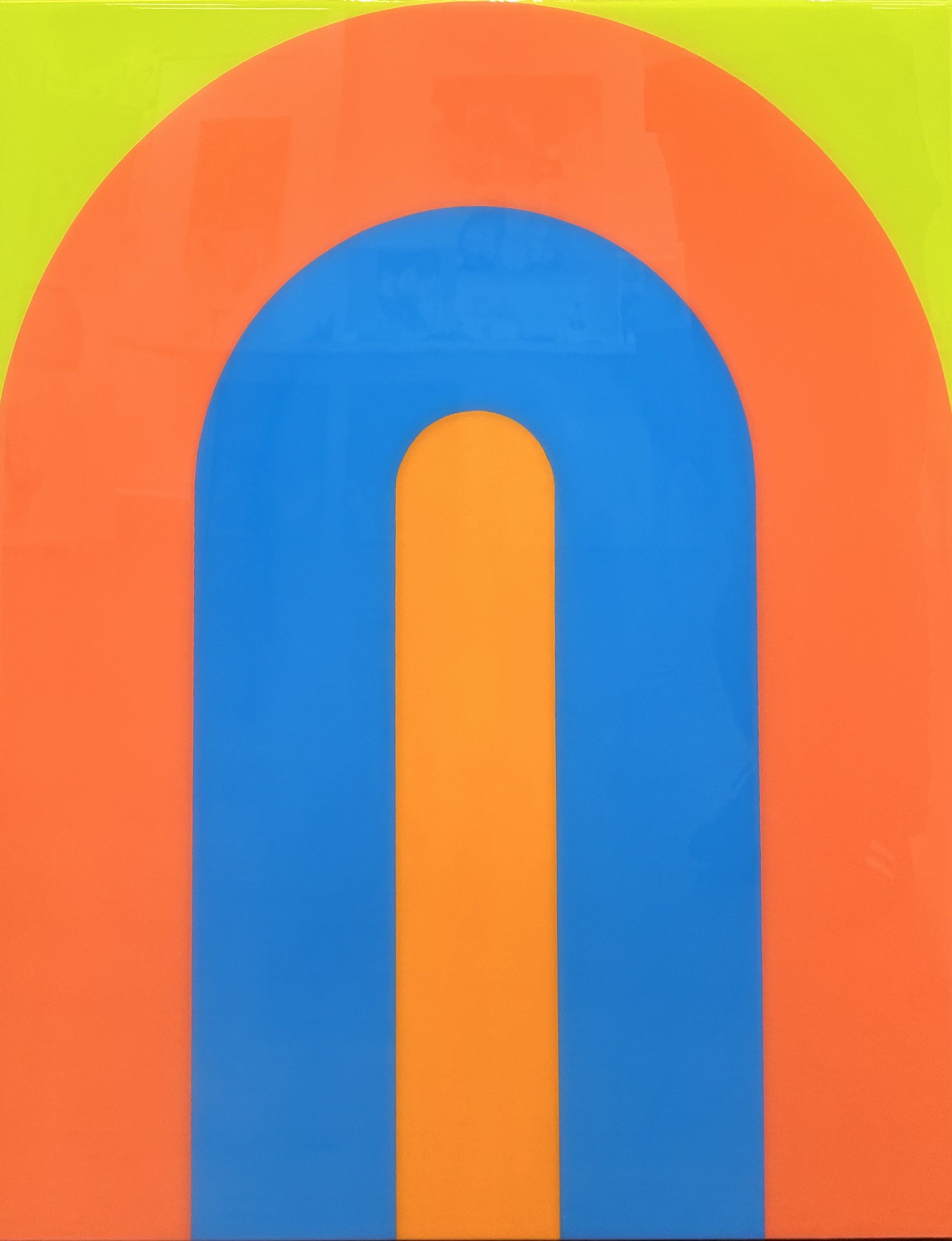
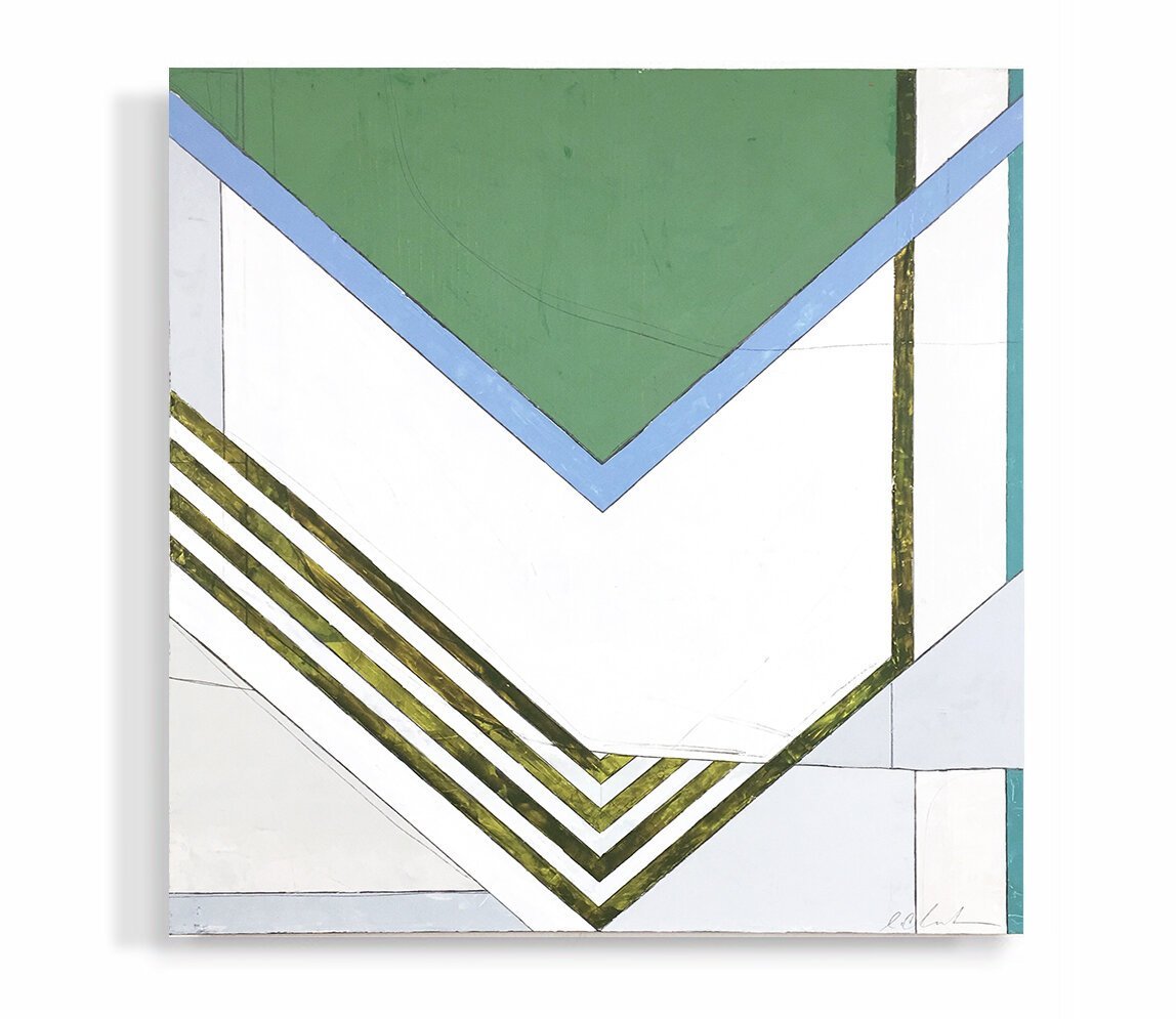
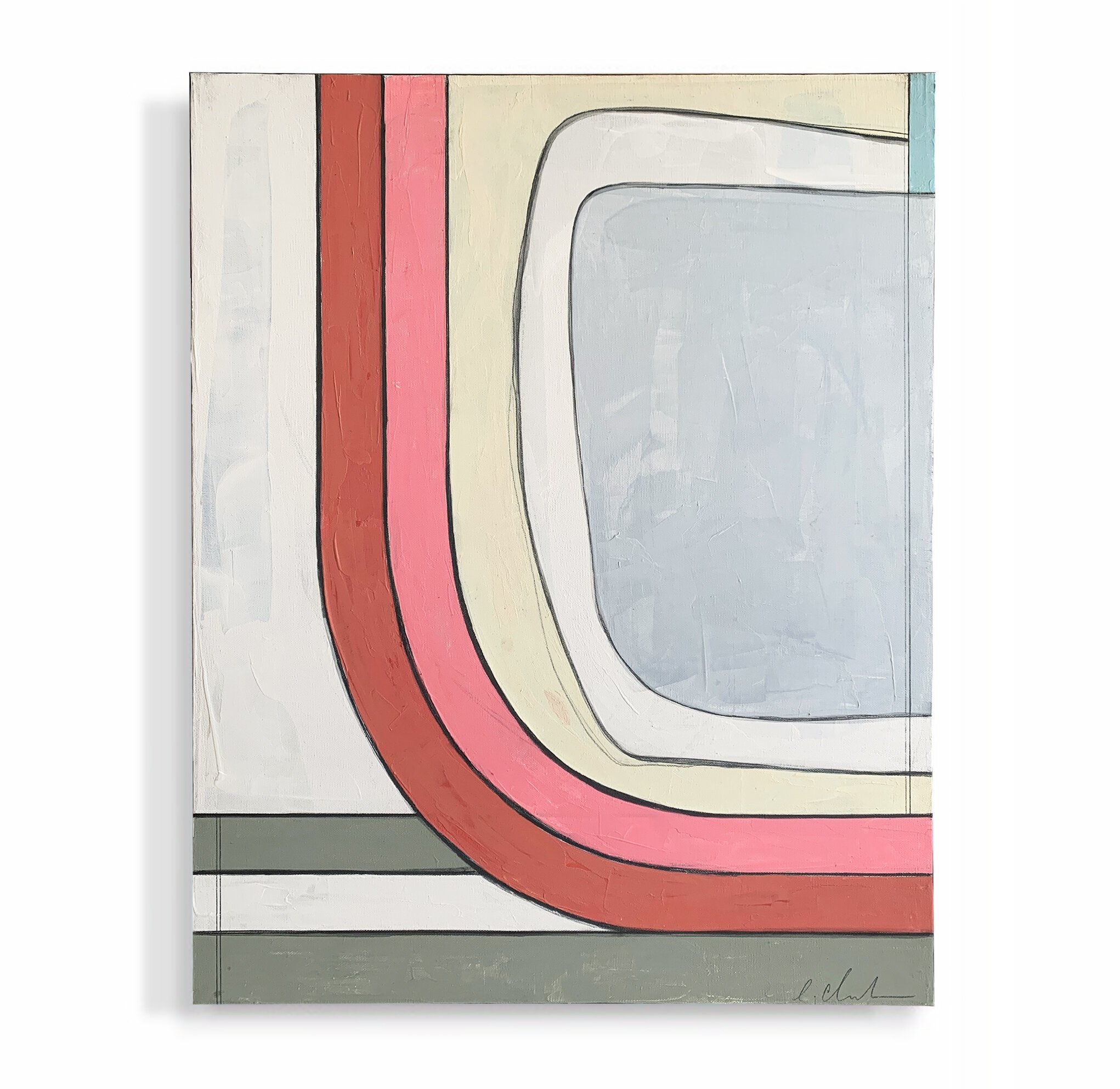


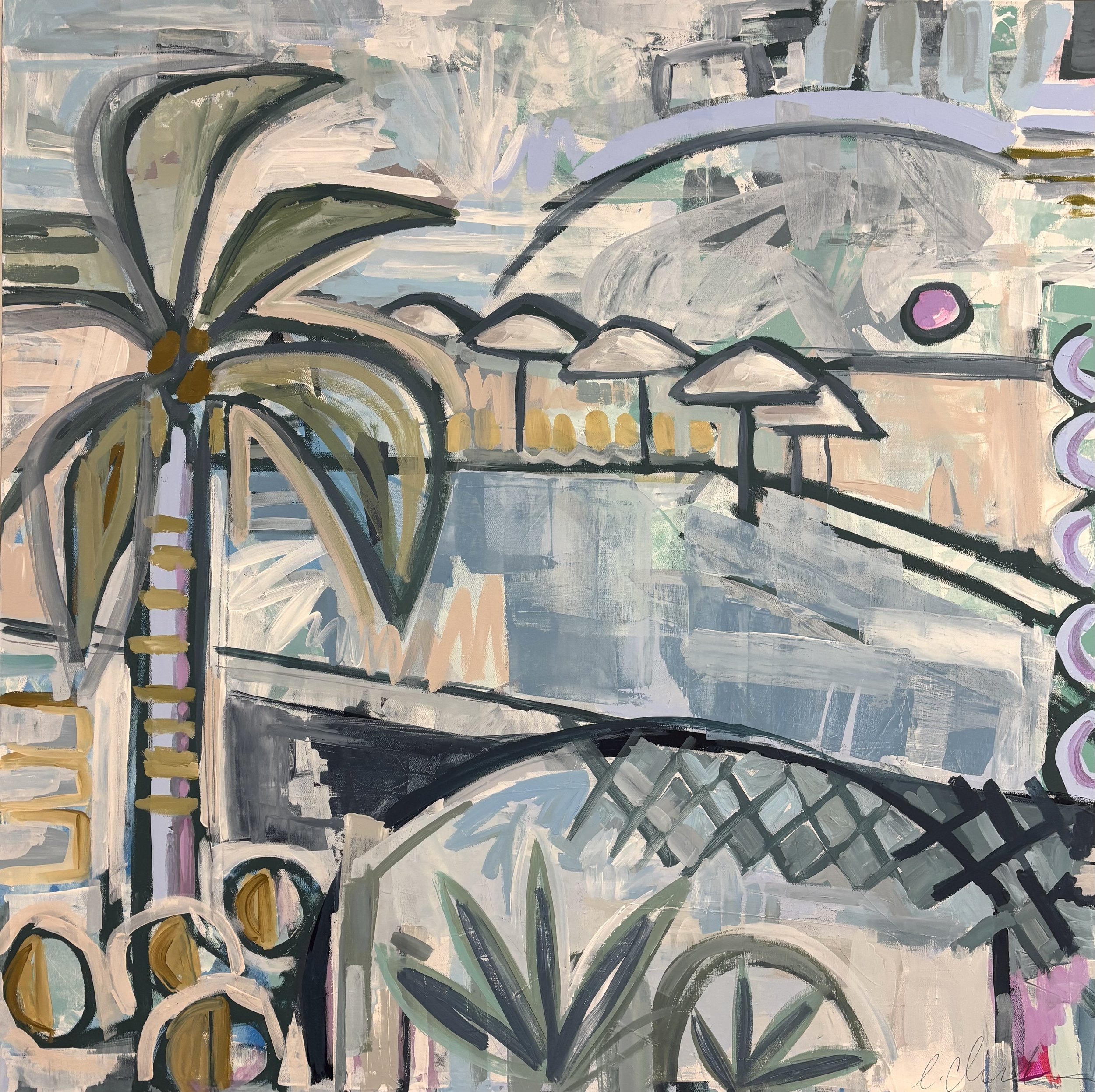

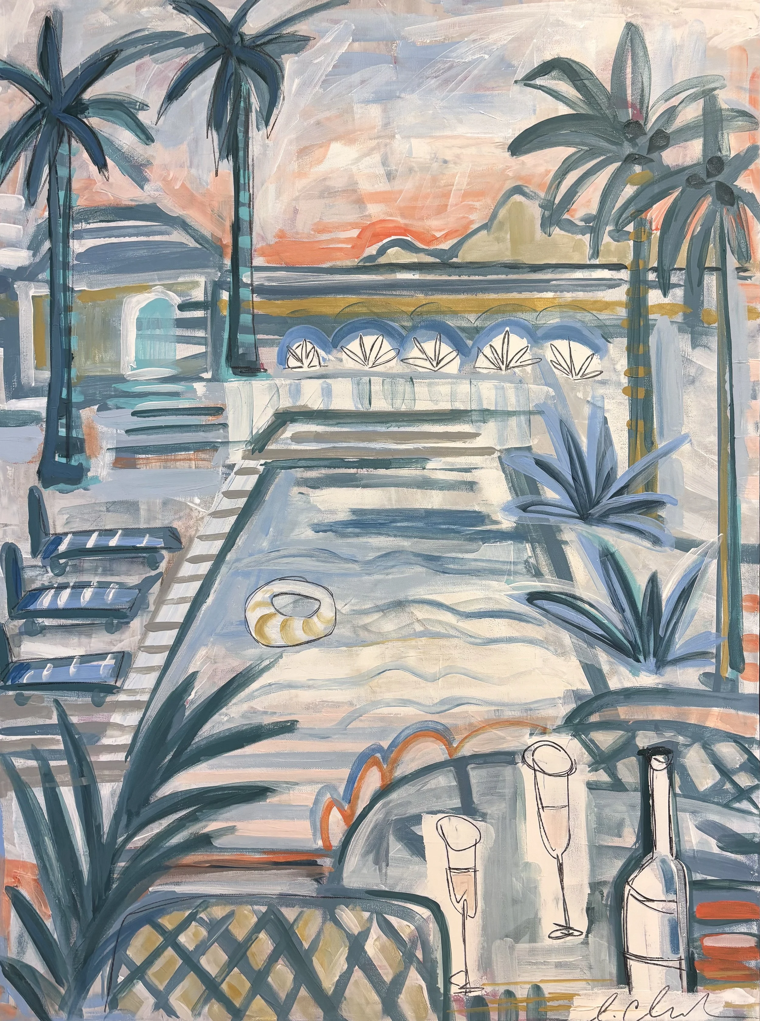
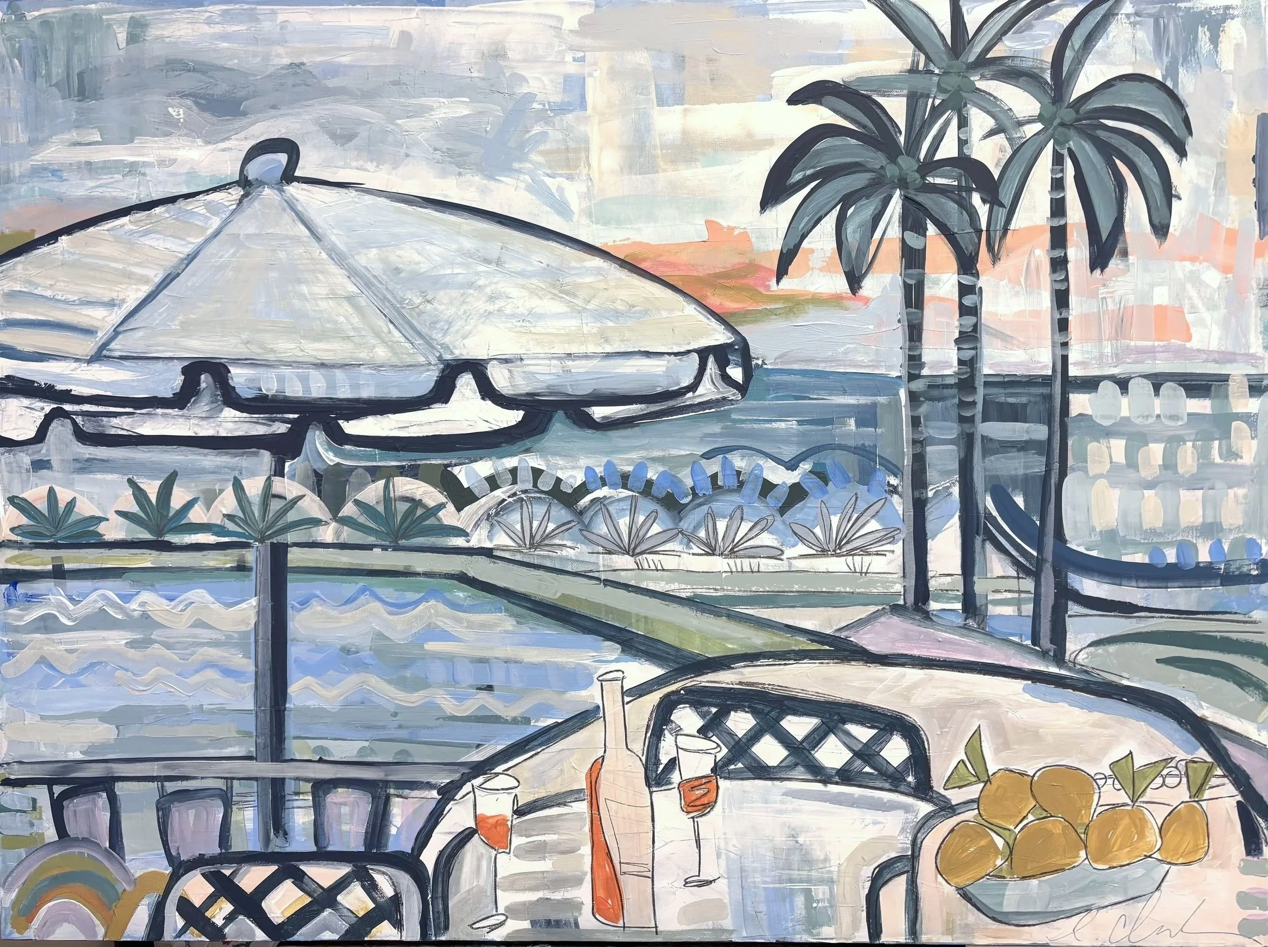
36×36 | acrylic on canvas